Antique Japanese Woodblock Print Identification Guide: Artists, Seals, and Dating
Almost every attic in the Western world seems to hold a Japanese woodblock print — a wave curling over fishing boats, a courtesan adjusting her collar, a rainstorm slanting across a bridge. Some are genuine Edo-period sheets worth more than the house they were found in. Far more are twentieth-century reprints, souvenir copies, or photomechanical posters. The images look nearly identical at a glance, and that is precisely the problem: this is a field where the difference between a few dollars and a few thousand lies in details most people never think to look at.
The good news is that Japanese prints are among the most systematically documented objects in the entire antiques world. Because the Edo government regulated publishing, most commercial prints from roughly 1790 to 1875 carry censor seals and date seals that can narrow a print to a specific year and often a specific month. Publishers used registered trademarks. Artists signed in consistent, catalogued forms. Once you know where to look, a print will frequently tell you who designed it, who published it, and when it was approved for sale.
This guide covers what ukiyo-e actually is, the standard sizes and formats, how prints were made and why that matters for authentication, how to read signatures, publisher marks, and the censor-seal sequence used for dating, the major artists and schools from the Edo golden age through shin-hanga, the paper and pigment clues that separate period sheets from later work, how to judge an impression, condition problems specific to Japanese prints, what drives value, and how to spot the reproductions that flood the market. Whether you inherited a framed print or are sorting through a portfolio at an estate sale, the goal is the same: name the artist, place the date, and understand what you are holding.
Table of Contents
- What Ukiyo-e Is — and What Counts as Antique
- A Short History of the Japanese Print
- The Major Subject Genres
- Formats, Sizes, and Multi-Sheet Compositions
- How a Print Was Actually Made
- Reading the Artist's Signature
- Publisher Marks and Series Titles
- Censor Seals and Date Seals: The Dating Key
- Major Artists and Schools
- Shin-Hanga and Sōsaku-Hanga: The Twentieth Century
- Paper, Pigments, and Printing Clues
- Impressions, Editions, and Recut Blocks
- Reproductions, Copies, and Outright Fakes
- Condition Terms and Common Problems
- Value Factors and Price Ranges
- Care, Framing, and Storage
- Quick Identification Checklist
What Ukiyo-e Is — and What Counts as Antique
Ukiyo-e (浮世絵) translates roughly as "pictures of the floating world" — the pleasure districts, theatres, teahouses, and travel routes of Edo-period Japan (1603–1868). It describes a subject matter and a commercial culture, not a technique. The technique itself is mokuhanga: relief printing from carved cherry-wood blocks, one block per colour, printed by hand onto dampened paper without a press.
That distinction matters when you are sorting a stack of prints. Not every Japanese woodblock print is ukiyo-e, and not every ukiyo-e image you see is a woodblock print. Twentieth-century shin-hanga and sōsaku-hanga prints use the same technique with entirely different aims. Meanwhile a great many "ukiyo-e" images in circulation are photomechanical reproductions on modern paper with no carved block behind them at all.
The Three Tiers Collectors Recognise
It helps to sort any print into one of three broad periods before going further. Edo-period prints (roughly 1660s–1868) are the classical ukiyo-e canon and the scarcest material. Meiji-period prints (1868–1912) continue the tradition with new subjects — westernisation, railways, war reportage — and are far more common and generally more affordable. Twentieth-century prints (shin-hanga and sōsaku-hanga, roughly 1915 onward) are a separate and increasingly strong collecting field in their own right, not lesser objects. Only the first two are "antique" in the strict hundred-year sense, but all three are actively collected, and the same identification skills apply across all of them.
A Short History of the Japanese Print
The commercial print developed alongside a prosperous, literate urban merchant class in Edo (modern Tokyo) that wanted affordable images of the entertainers, actors, and fashions of its own world. Technology and taste moved together, and each phase left physical evidence you can use to date a sheet.
Monochrome and Hand-Coloured Beginnings
The earliest single-sheet prints, from the later 1600s, were sumizuri-e — black ink only, printed from a single key block, with Hishikawa Moronobu the pivotal early figure. Colour was then added by hand: tan-e used an orange lead pigment, beni-e a pink derived from safflower, and urushi-e added glue-thickened black that mimicked lacquer. A print with obviously hand-applied colour that sits unevenly across the black outlines is signalling an early date — or a deliberate imitation of one.
The Arrival of Full-Colour Printing
Printing in two or three colours (benizuri-e) appeared in the 1740s. The decisive breakthrough came around 1765, when the registration system and publishing economics matured enough to allow many blocks per image. The result was nishiki-e, "brocade pictures," full-colour prints associated above all with Suzuki Harunobu. Essentially every print most collectors encounter is a nishiki-e descendant.
The Golden Age and the Landscape Boom
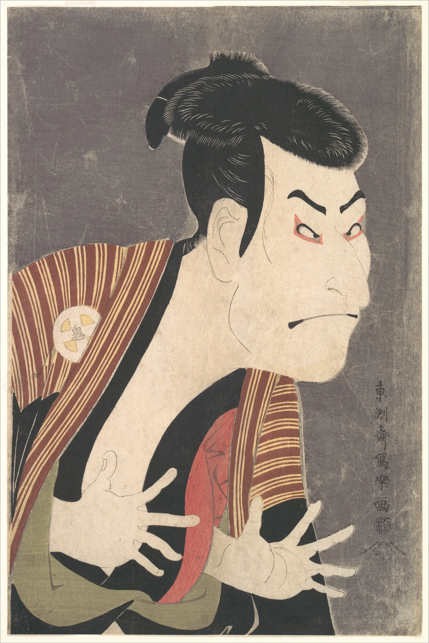
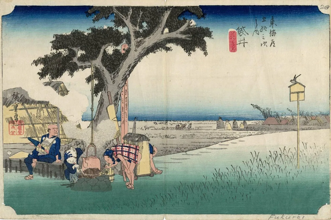
The late eighteenth century produced the classic figure work: Kitagawa Utamaro's close-up beauties and the compressed, explosive ten-month career of Tōshūsai Sharaku, whose actor portraits appeared in 1794–95 and then stopped entirely. In the 1830s the centre of gravity shifted to landscape, driven by Katsushika Hokusai's Thirty-six Views of Mount Fuji (c. 1830–32) and Utagawa Hiroshige's Fifty-three Stations of the Tōkaidō (1833–34). The timing was not accidental: imported Prussian blue had recently become affordable, and it made deep, stable skies and water possible for the first time.
Reform, Meiji, and Decline
The Tenpō Reforms of the early 1840s restricted depictions of actors and courtesans and tightened censorship, pushing designers toward history, warriors, and landscape. After the Meiji Restoration of 1868, prints documented a rapidly modernising country — brick buildings, steam trains, Western dress — often in the harsh new synthetic reds and purples that make Meiji sheets instantly recognisable. Photography and mechanical printing then eroded the commercial market, and by the early twentieth century the traditional publishing system had largely collapsed, setting the stage for its deliberate revival.
The Major Subject Genres
Identifying the genre narrows the field of likely artists and dates before you read a single character, because most designers specialised.
Bijin-ga: Pictures of Beautiful Women
Elegant standing or seated women, usually courtesans or teahouse waitresses, shown for their clothing and bearing as much as their faces. Associated with Harunobu, Utamaro, Eishi, and later Utagawa designers, and revived beautifully in the twentieth century by Itō Shinsui and Hashiguchi Goyō.
Yakusha-e: Actor Prints
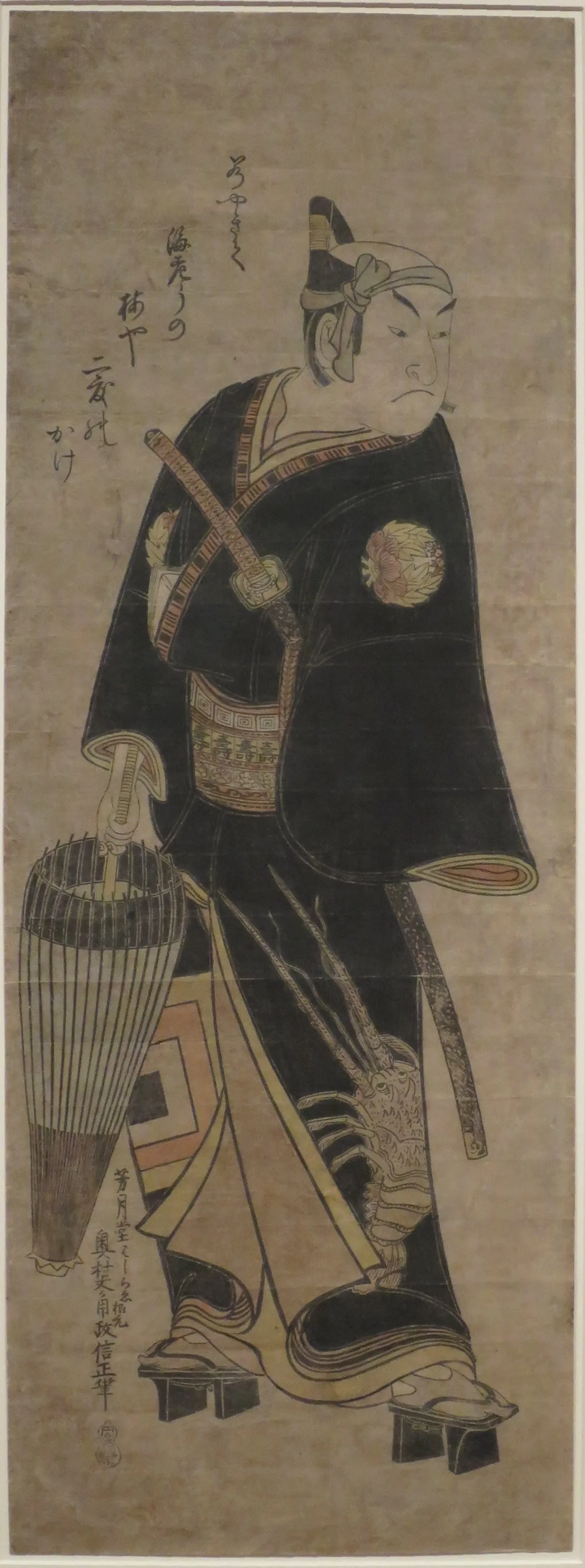
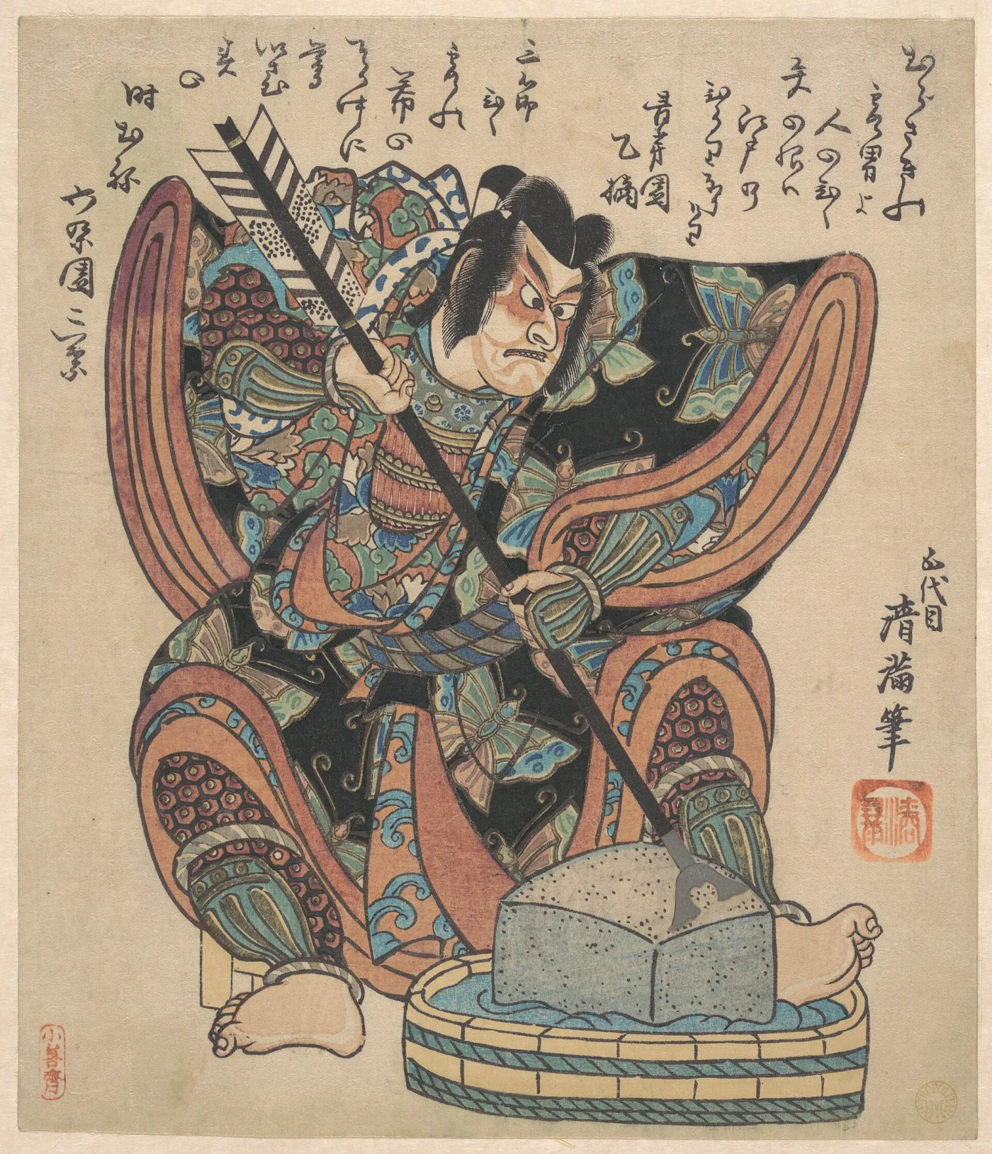
Kabuki actors in role, often with the actor's crest (mon) worked into the costume — a useful identification clue in itself, since crests are catalogued. Sharaku, Toyokuni I, and Kunisada dominate the field. Actor prints are the single most common category of surviving Edo and early Meiji sheets.
Fūkei-ga: Landscape and Travel
The famous-place and travel-route views of Hokusai and Hiroshige, usually issued in numbered series tied to a road, a province, or a set of viewpoints. Because series were reprinted for decades, landscapes are also where the impression-quality question bites hardest.
Musha-e, Kachō-e, and Surimono
Musha-e are warrior and legend prints, the specialty of Utagawa Kuniyoshi, full of armour, monsters, and violent diagonals. Kachō-e are bird-and-flower studies, often in narrow vertical formats and closely related in spirit to the painted decoration on Satsuma pottery and other Japanese decorative arts. Surimono are a special case: privately commissioned, small-format, deluxe prints made for poetry groups and gift exchange, not commercial sale. They typically show lavish metallic pigments, blind embossing, and printed poems — and because they were never publicly sold, they carry no censor seal.
Formats, Sizes, and Multi-Sheet Compositions
Japanese prints were cut from standard paper sheets, so sizes are consistent enough to be diagnostic. Measure an untrimmed print and you have immediately narrowed its likely purpose and period. All measurements below are approximate; period paper varied and most surviving prints have lost a little to trimming.
The Standard Sheet Sizes
Ōban (roughly 38–39 × 25–26 cm, about 15 × 10 in) is the workhorse format — most famous landscapes and later actor prints are ōban. Chūban (about 26 × 19 cm) is the mid-size sheet common in Harunobu-era work and in many series. Hosoban (about 33 × 15 cm) is the narrow vertical used for eighteenth-century actor prints, frequently issued in sets of three that hang together. Aiban (about 34 × 22 cm) sits between chūban and ōban. Koban covers various small formats used for cheap prints and inserts.
Long and Special Formats
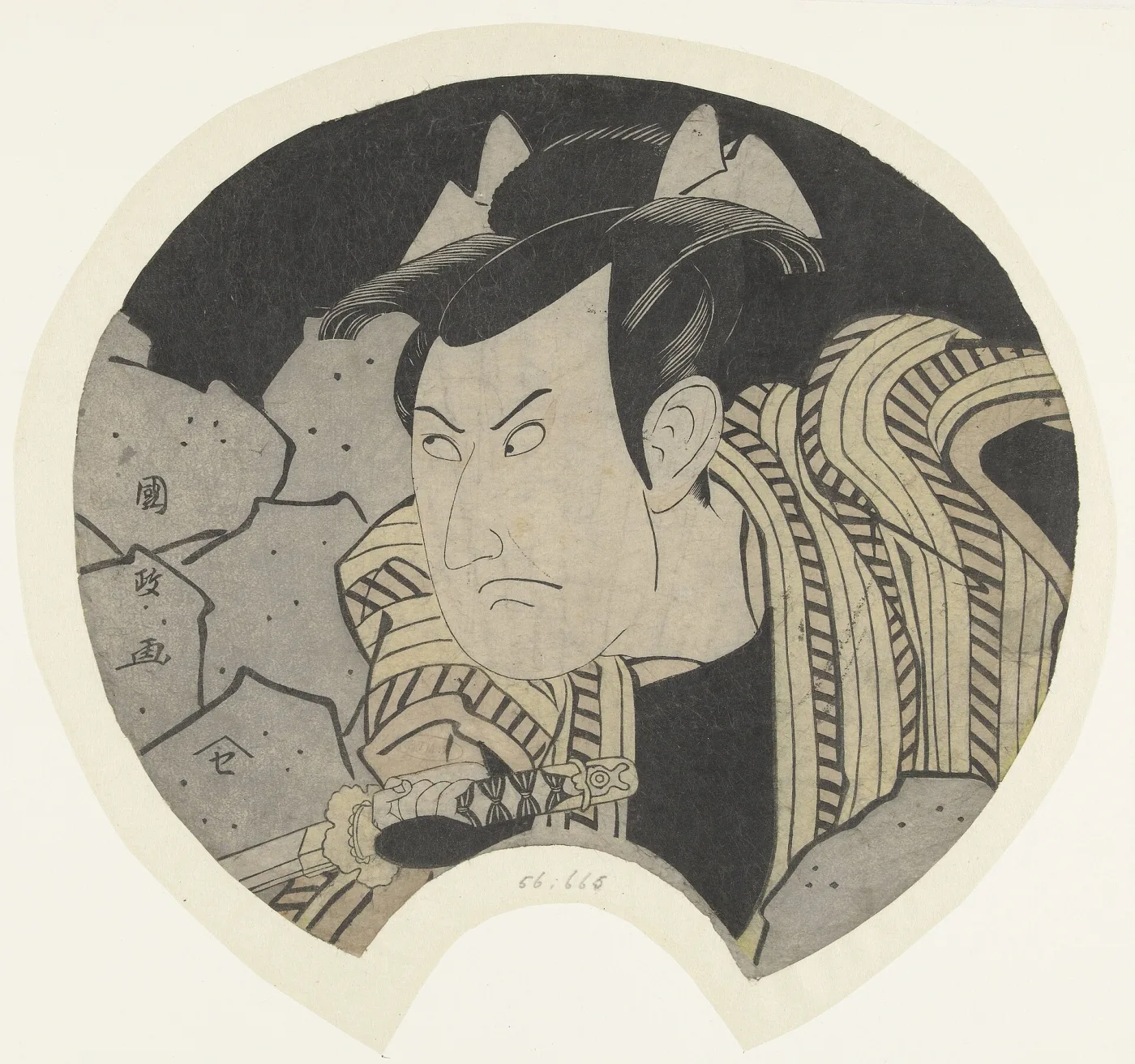
Kakemono-e are tall hanging-scroll-shaped prints, usually two ōban sheets joined, around 76 × 23 cm. Hashira-e ("pillar prints") are extremely narrow verticals designed to hang on a house post. Uchiwa-e are fan prints, printed with the outline of a rigid fan and often cut out and mounted — surviving flat, uncut examples are scarce, and mounted ones overlap with the collecting field of antique fans. Shikishiban is the near-square format typical of surimono.
Diptychs, Triptychs, and Orphan Sheets
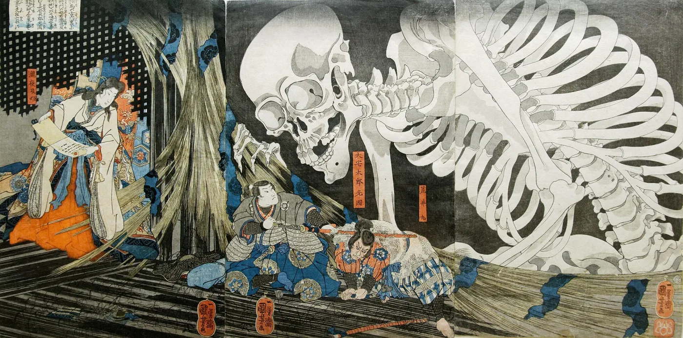
Many designs span two sheets (nimaitsuzuki) or three (sanmaitsuzuki), each printed separately and sold as a set. Complete multi-sheet compositions are worth substantially more than the sum of their parts, and a great many single sheets on the market are orphans from broken sets. If a composition runs off the edge of the paper mid-figure, or the signature appears only on one side of what looks like a complete scene, suspect a separated panel. Each sheet of a triptych normally carries its own seals, so an orphan is still fully datable.
How a Print Was Actually Made
Understanding the workshop process explains nearly every authentication test that follows, because each stage leaves physical traces that photomechanical copies cannot reproduce.
The Four-Way Collaboration
A commercial print was made by four parties under the hanmoto system. The publisher (hanmoto) financed the project, chose the subject, held the blocks, and carried the commercial risk. The artist (eshi) supplied a brush drawing on thin paper. The block carver (horishi) pasted that drawing face-down onto a cherry plank and cut through it, destroying the original in the process, then cut a separate block for each colour. The printer (surishi) inked each block with water-based pigment and rice paste and burnished the damp paper against it with a baren, a coiled-cord disc.
Note what this means for attribution: the artist's name on the print identifies the designer, not the maker of the object in front of you. The publisher owned the blocks and could reprint for decades, which is why "a genuine Hiroshige" and "a valuable Hiroshige" are very different claims.
The Traces the Process Leaves
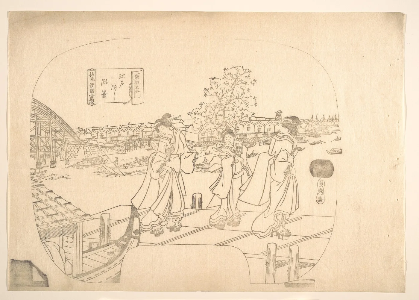
Hand printing without a press produces evidence you can check with a loupe and raking light. Kentō marks — an L-shaped notch and a straight stop cut into each block for registration — align the colours; slight misregistration between colour areas is normal and is a positive sign of hand printing. Baren marks, faint circular burnishing swirls, are often visible on the reverse in broad colour areas. Because the pigment is water-based and the paper was damp, colour penetrates into the fibres, so strong colours usually show through on the verso. Wood grain from the plank frequently prints in large flat areas, particularly skies.
Special Printing Effects
Several deliberate effects signal quality and, sometimes, date. Bokashi is hand-wiped gradation — a sky darkening upward, water deepening toward the horizon — applied individually to each impression, so it varies slightly from sheet to sheet and cannot be identical across copies. Karazuri is blind embossing, printed from an uninked block to raise texture in snow, white robes, or skin. Kirazuri is a mica ground giving a glittering background, used on deluxe eighteenth-century portraits. Shōmenzuri burnishes an area to a sheen. All of these are three-dimensional; none survive photographic copying.

Reading the Artist's Signature
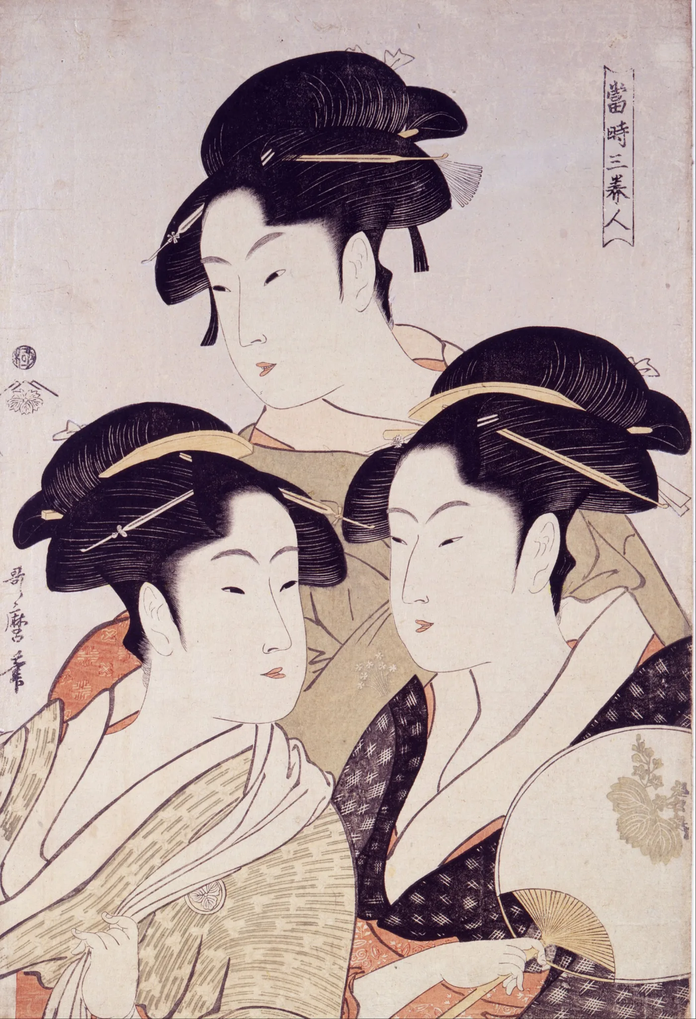
The signature (rakkan) usually sits in a vertical line along one edge of the design, sometimes inside a decorative cartouche. You do not need to read Japanese to use it: signature forms are catalogued, and matching the shape of the characters against a reference is a standard identification method.
Signature Suffixes and What They Mean
Most signatures consist of an art name followed by a verb-like suffix. Hitsu (筆, "brush of") and ga (画, "drawn by") are the most common; zu (図, "designed by") also appears. Some signatures add giga ("drawn for amusement") or a studio name. The suffix itself occasionally helps: individual artists favoured particular forms at particular stages of their careers, and the reference literature records which.
Artists Changed Their Names — Constantly
This is the single most confusing feature of the field, and also one of the most useful for dating. Japanese artists took new art names at career milestones and passed old ones to students. Hokusai signed as Shunrō, then Sōri, then Hokusai, later Taito, then Iitsu, and finally Manji — each name corresponding to a defined period of his life, so the signature alone brackets the design within a few decades. Utagawa Kunisada, the most commercially successful designer of the nineteenth century, adopted the name Toyokuni in the mid-1840s and is now catalogued as Toyokuni III, which is why the same hand appears under two very different signatures.
School Cartouches
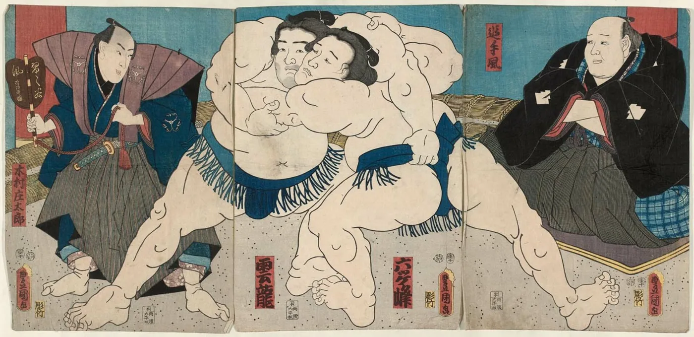
The Utagawa school — by far the largest, encompassing Toyokuni, Kunisada, Kuniyoshi, Hiroshige, and dozens of pupils — frequently enclosed its signatures in a toshidama cartouche, a distinctive rounded-square outline with a small notch, derived from a New Year's gift wrapper. Spotting a toshidama immediately tells you which school you are in, even before reading the name.
What a Missing Signature Means
An unsigned commercial print is unusual and worth investigating. Some genuine categories are routinely unsigned: many surimono, most book illustrations removed from bound volumes, and certain late Meiji reportage prints. But a completely blank margin where a signature, publisher mark, and seal should all appear is a strong reproduction warning, since copyists often work from a cropped photograph that never included the margin content.
Publisher Marks and Series Titles
The publisher's mark (hanmoto-in) is typically a small trademark-like device in a lower corner or side margin, often combining a stylised character with the shop's symbol. Publishers were businesses with known operating dates and known addresses, so identifying one both confirms authenticity and brackets the date.
Publishers Worth Knowing
Tsutaya Jūzaburō, the great late-eighteenth-century publisher behind Utamaro and Sharaku, used a mark combining an ivy leaf with a stylised triple-mountain form. Hōeidō published Hiroshige's original Tōkaidō series and is central to any discussion of that set. Nishimuraya Yohachi, Uoya Eikichi, and Moriya Jihei are among the many nineteenth-century houses whose marks appear constantly. Reference works catalogue several hundred publisher seals with active date ranges — the standard route is to match the mark visually rather than translate it.
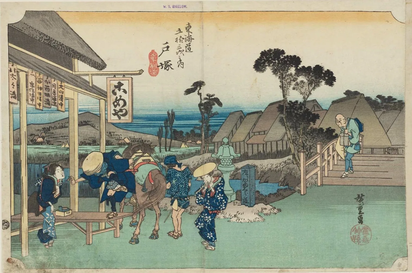
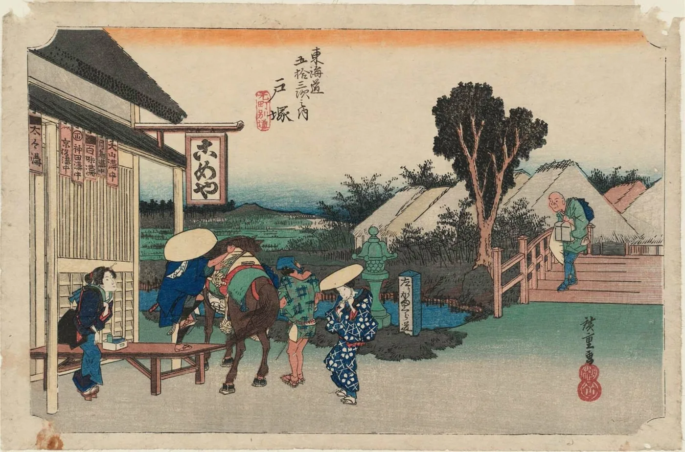
Both of these are period impressions of one Hiroshige design — Totsuka, "Motomachi Fork", from the Hōeidō Tōkaidō, about 1833–35 — and neither is a reproduction. What separates them is the block state and the marks in the lower right corner: the first sheet carries the seals of the two houses that published the series jointly, the second carries only one. The colour schemes were reworked at the same time, which is why the sky band is yellow on one and orange on the other. This is exactly how a catalogue distinguishes states, and it is why "a Hiroshige Tōkaidō" is never a complete description of a print — the series, the station, the version and the seals all have to be recorded before a price means anything.
Series Titles and Sheet Numbers
Most prints belong to a series, and the series title normally appears in a decorative cartouche at the top, with the individual print's title beside it. On numbered series — the Tōkaidō stations, the Fuji views, the provinces — the station or sheet number is part of the title cartouche. Recording the exact series title is essential for valuation, because within a single series individual designs vary enormously in desirability.
Meiji Publication Data
From the mid-1870s, Meiji regulations required prints to carry publication information in ordinary text rather than a seal: publisher's name, address, and a date, usually printed in a small block in the margin. If you see a line of small characters along the lower or left edge that looks like an address rather than a stamp, you are almost certainly holding a Meiji print, and the date is likely stated outright in the Meiji era-year system.
Censor Seals and Date Seals: The Dating Key
This is the part of Japanese print identification with no parallel in Western antiques. Because the Tokugawa government required commercial prints to be approved before publication, most sheets from roughly 1790 to 1875 carry small round or oval seals recording that approval — and the seal system changed repeatedly, in documented steps. Matching the seal type against the known sequence dates a print far more precisely than style ever could.
The Broad Sequence
The framework below is the standard one used by specialists. Treat the boundary years as approximate; the reference literature gives month-level detail and several transitional overlaps.
From about 1790 to 1842, prints carry the round kiwame seal (極, "approved") — a single circular stamp, easily recognised even by a beginner. From about 1842 to 1846, following the Tenpō Reforms, the kiwame seal is replaced by a single nanushi seal bearing the personal name of one of the appointed censors. From roughly 1846 to 1852, prints carry two nanushi name seals side by side. Around 1852–1853, a date seal joins the two censor seals. Through the mid-1850s the combination shifts to one censor seal plus a date seal, with the character aratame (改, "examined") appearing. From the later 1850s into about 1871, the usual pairing is an aratame seal with a date seal. After the early 1870s, seals give way to the printed publication data described above.
Reading a Date Seal
The date seal is the most powerful single element on the sheet. It normally records the year using the traditional sexagenary cycle — a combination of one of ten "stems" and one of the twelve zodiac animals (rat, ox, tiger, rabbit, dragon, snake, horse, goat, monkey, rooster, dog, boar) — plus a numeral for the lunar month. Because the zodiac repeats every twelve years and the full cycle every sixty, a zodiac seal combined with the censor-seal type and the artist's active dates almost always yields a single unambiguous year, and frequently a month.
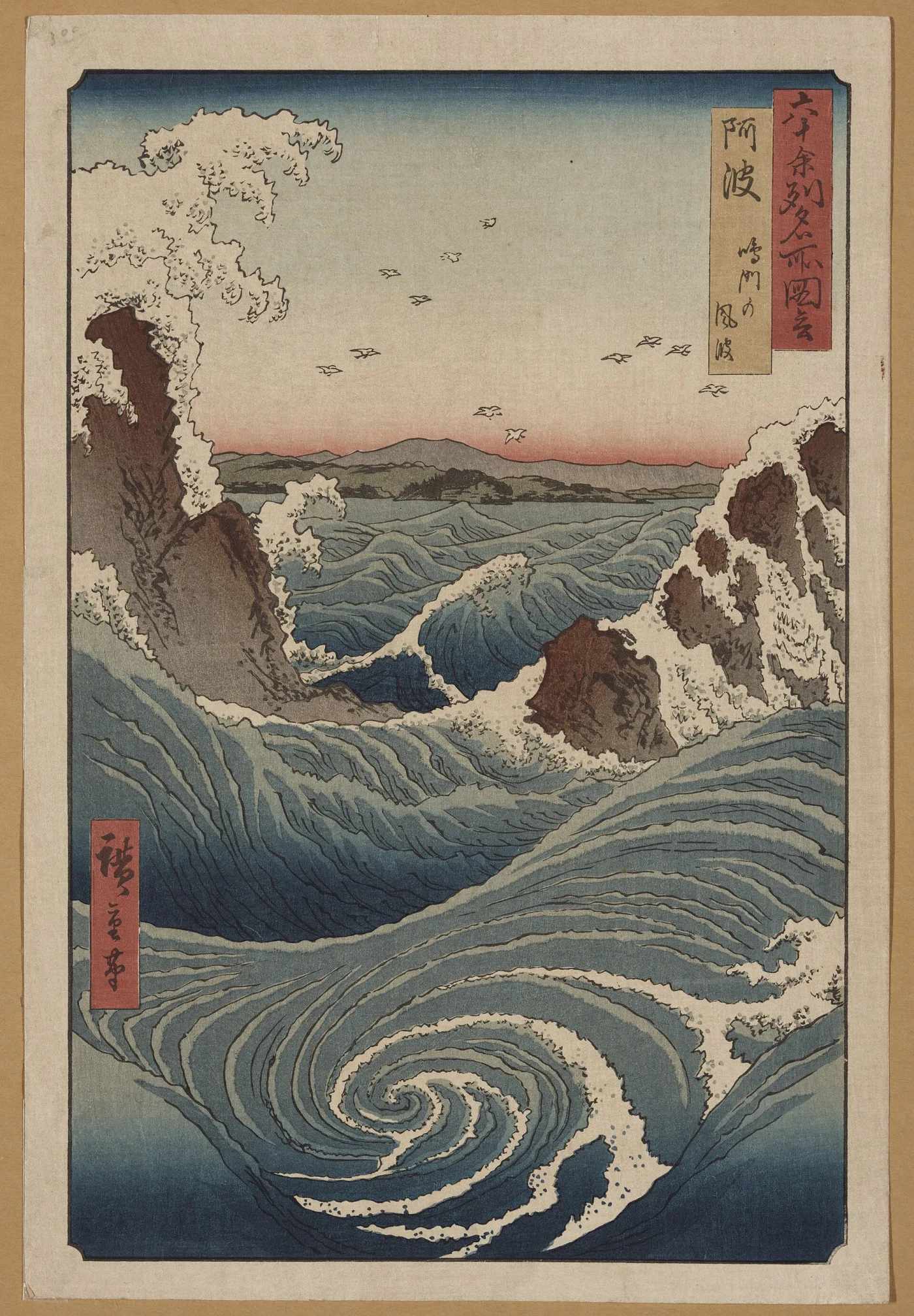
In practice the workflow is: identify which censor-seal configuration is present, which gives you a range of a few years; read the zodiac animal in the date seal; then select the one year within that range matching the animal. This is exactly the kind of cross-referencing that also underpins provenance research in other fields — several independent marks converging on one answer.
When Seals Are Absent
A missing censor seal is not automatically bad news, but it always needs explanation. Legitimate reasons include surimono and other privately published work, prints made outside the regulated commercial system, book pages, sheets trimmed into the image area, and prints from before the censorship regime or after it lapsed. Illegitimate reasons include reproduction from a cropped source image. If the margins are intact and there is simply nothing there, be sceptical.
Major Artists and Schools
A working knowledge of a dozen names covers the large majority of prints that turn up outside Japan. As with antique paintings, style narrows the field and marks confirm it — never the reverse.
Katsushika Hokusai (1760–1849)
The most internationally famous Japanese artist, prolific across seventy years and many names. Thirty-six Views of Mount Fuji — which actually runs to forty-six designs — contains Under the Wave off Kanagawa, the "Great Wave," the most reproduced image in the history of printmaking and therefore the design you are statistically most likely to encounter as a copy. Genuine early impressions are museum-level objects; the overwhelming majority of Great Waves in circulation are modern.
Utagawa Hiroshige (1797–1858)
The great landscape poet of the medium, known for atmospheric weather effects, bold croppings, and superb bokashi skies. The Fifty-three Stations of the Tōkaidō (Hōeidō edition, 1833–34) and One Hundred Famous Views of Edo (1856–58) are the central series. Hiroshige designs were reprinted from original and recut blocks for over a century, so with Hiroshige the impression question is almost always the decisive one.
Kitagawa Utamaro and Tōshūsai Sharaku
Utamaro (c. 1753–1806) defined the close-up bust portrait of a beauty, often against a mica ground. Sharaku's actor portraits, produced for Tsutaya over about ten months in 1794–95, are unsparing character studies and are among the most valuable and most frequently reproduced prints in the field.
The Utagawa Dynasty
Utagawa Kunisada / Toyokuni III (1786–1865) was the most commercially productive designer of the century, responsible for an enormous number of actor and beauty prints — which is why so many genuine, well-preserved, modestly priced Edo prints on the market are his. Utagawa Kuniyoshi (1797–1861) is the warrior and fantasy specialist, prized for dynamic triptychs, giant skeletons, and cats. Both trained a generation of Meiji designers.
The Meiji Generation
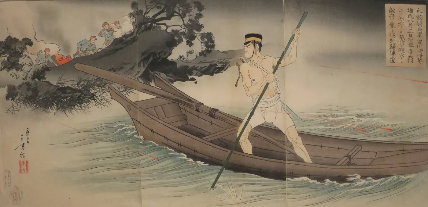
Tsukioka Yoshitoshi (1839–1892) bridged Edo and Meiji, best known for One Hundred Aspects of the Moon. Kobayashi Kiyochika (1847–1915) pioneered "light-ray pictures" exploring gaslight, dusk, and shadow, and produced widely collected war reportage prints. Toyohara Chikanobu (1838–1912) documented court and historical subjects in large triptychs. Meiji war triptychs from the Sino-Japanese and Russo-Japanese conflicts are common, historically fascinating, and still among the most affordable genuine antique prints available.
Shin-Hanga and Sōsaku-Hanga: The Twentieth Century
Two movements revived the woodblock print after the commercial collapse of the ukiyo-e trade, and they are routinely confused with each other and with earlier work.
Shin-Hanga: "New Prints"
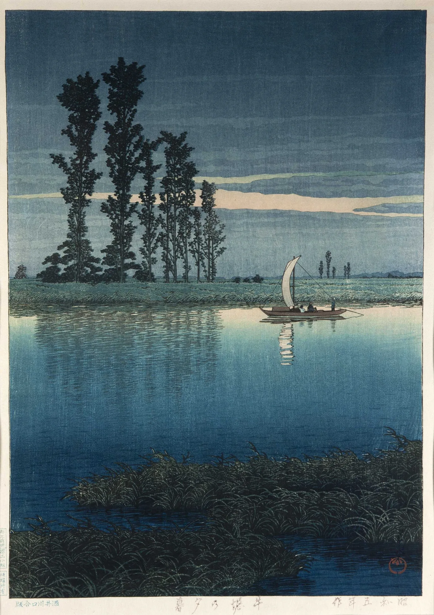
Beginning around 1915, the publisher Watanabe Shōzaburō deliberately reconstructed the traditional four-way workshop — publisher, designer, carver, printer — to make new prints in the old manner, largely for an export market. The results are technically superb: deep bokashi, elaborate colour, high production values. Kawase Hasui (landscapes and snow scenes) and Hiroshi Yoshida (mountains, gardens, and foreign views, often signed in pencil in English as well) are the best-known names, alongside Itō Shinsui for beauties and Hashiguchi Goyō for a small, exquisite body of work. Shin-hanga prints usually carry a publisher's seal, and Watanabe's seals changed over time in ways that distinguish pre-war impressions from post-war reprintings — an important value distinction, since the blocks continued in use for decades.
Sōsaku-Hanga: "Creative Prints"
The opposing philosophy held that the artist should design, carve, and print the work personally. Sōsaku-hanga prints are consequently more experimental, often abstract or expressionist, printed in small numbered editions, and frequently signed in pencil with an edition fraction in Western numerals. Onchi Kōshirō, Hiratsuka Un'ichi, and Munakata Shikō are the central figures. A pencil signature and a fraction such as "12/50" in the lower margin points firmly to this tradition — and is essentially never correct on an Edo-period print.
Telling Them Apart at a Glance
Shin-hanga looks traditional in subject and flawless in execution, with a publisher seal and no edition number. Sōsaku-hanga looks modern, shows visible tool marks, and carries a pencil signature and edition number. Edo and Meiji prints carry brush-form signatures printed from the block, censor or publisher seals, and never a pencil signature.
Paper, Pigments, and Printing Clues
When marks are ambiguous or absent, the physical materials usually settle the question. These checks require nothing more than good light, a loupe, and a careful look at the back of the sheet.
Washi: The Paper Itself
Traditional prints are on washi made from kōzo (paper mulberry) fibre, sometimes on the thicker, softer hōsho grade for deluxe work. Held to light, washi shows long, irregular, visible fibres and often faint laid lines from the papermaking screen. The tone is a warm cream, never a bright optical white. Modern machine-made wood-pulp paper looks flat and uniform by comparison, feels harder, and frequently contains optical brighteners that glow noticeably under a UV lamp — one of the fastest reproduction tests available.
Colour Penetration and the Verso
Because water-based pigment was burnished into damp paper, colour on a genuine print soaks into the fibres and is usually visible from the back, sometimes strongly. A print whose reverse is clean white while the front is richly coloured is very likely a surface-printed modern copy. Turn every print over before forming an opinion.
Pigments as a Dating Tool
Colour chemistry gives useful hard boundaries. Prussian blue (bero-ai), an imported synthetic, came into widespread Japanese print use around 1829–30; its arrival is directly tied to the landscape boom, and a print built on deep, saturated blue is unlikely to predate that. Beni, the safflower pink, is notoriously fugitive — it fades to pale tan or vanishes, which is why so many period prints show grey-blue skies that were originally purple and why unfaded pinks on a supposedly early sheet deserve scrutiny. Aniline and other synthetic dyes arrived from the 1860s and dominate Meiji prints; their hard magentas, acid purples, and orange-reds are unmistakable once you have seen them and are essentially impossible on a genuine pre-1860 print.
Evidence of Hand Printing
Under magnification, a genuine woodblock print shows a solid, continuous ink film with a slightly ragged carved edge where the block met the paper, plus occasional wood grain. A photomechanical reproduction shows a regular halftone dot pattern or rosette under a loupe — the single most conclusive test there is. Also look for slight colour misregistration, embossing you can feel with a fingertip, and baren swirls on the verso. Modern giclée and inkjet copies show no dot rosette but reveal fine sprayed droplets at high magnification and sit entirely on the paper surface.
Impressions, Editions, and Recut Blocks
Japanese prints have no fixed edition sizes. A publisher printed to demand, for as long as the blocks held out and the design sold. Two sheets can therefore be equally "genuine" and differ tenfold in value.
What an Early Impression Looks Like
An early impression from fresh blocks shows crisp, unbroken key-block outlines, especially in fine detail such as hair, rigging, or foliage; strong, subtle bokashi gradations; and full, deliberate colour. A late impression from worn blocks shows thickened or broken outlines, lost fine detail, crude or absent gradation, and often simplified or garish colour as the publisher cut costs. Learning to see this difference is the highest-value skill in the field, and the reason serious buyers compare a sheet against catalogued reference impressions before paying up.
Later Editions and Recut Blocks
When blocks wore out or burned, popular designs were recut — new blocks carved from an existing print rather than a fresh drawing. Recut editions are genuine woodblock prints of the right design, but they are copies of copies: line quality degrades, small details drift, and colours are frequently reinterpreted. Many nineteenth- and twentieth-century Hiroshige and Hokusai sheets on the market are recut-block editions. Comparison against a documented early impression is the reliable way to tell, which is why illustrated catalogues raisonnés matter so much here.
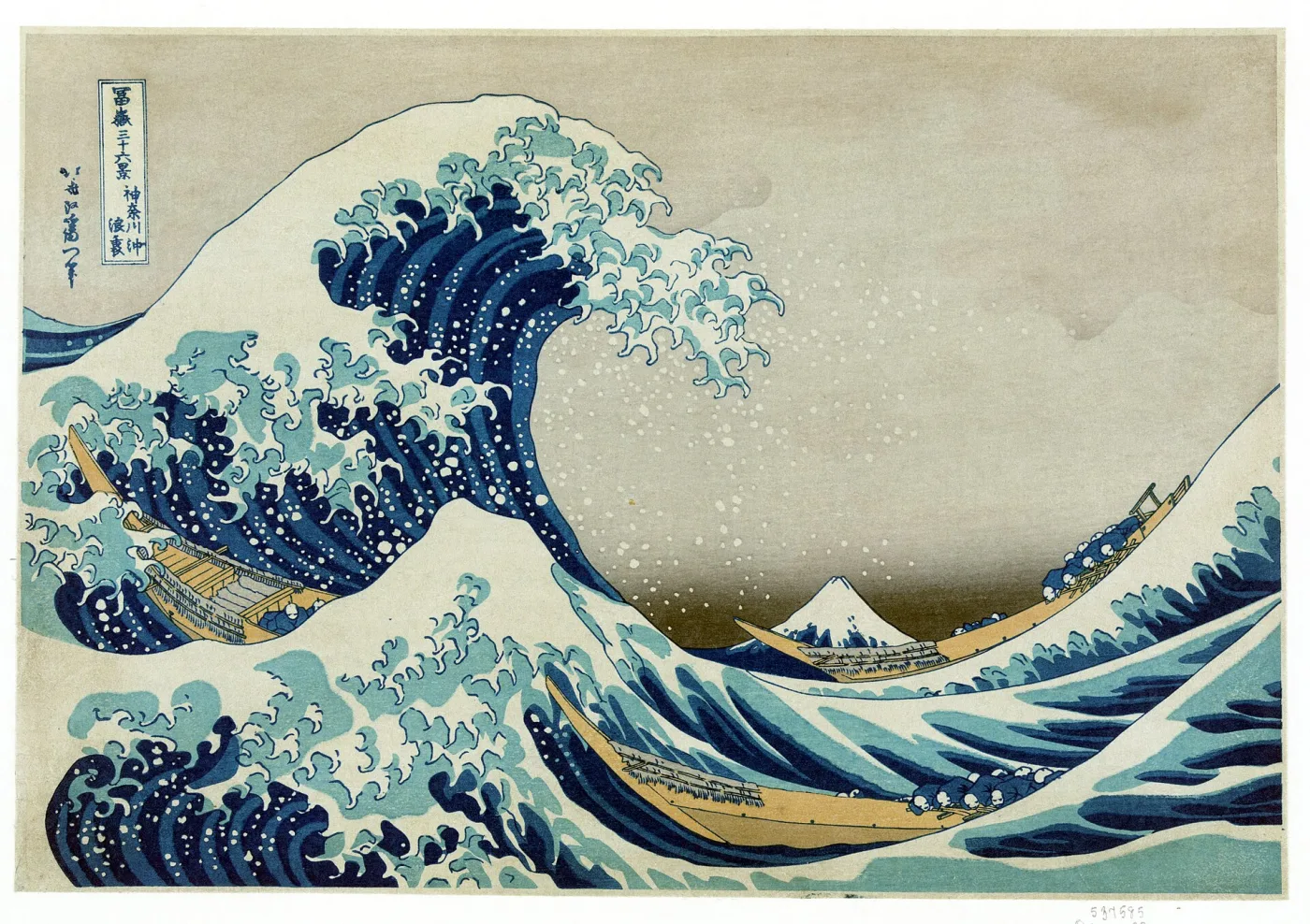
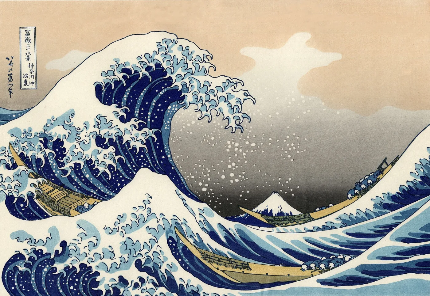
Both of these are genuine woodblock prints of Hokusai's Under the Wave off Kanagawa, and only the first is a period sheet. The second is catalogued as a modern recut copy: new blocks cut from an existing print rather than from Hokusai's drawing, then printed by traditional methods around 1930. Compare the paper first — unevenly toned cream against a flat, bright, even white. Then the colour: the period sheet's sky has aged to a grey-brown and its blues run through several strengths, while the copy is uniform, saturated, and pink where the original is not. Then the line, which in the copy is regular and slightly stiff where the original wavers. A recut print like this is an honest object with real craft value, and the problem only starts when someone prices it as the period sheet.
Twentieth-Century Reprint Publishers
Several respected houses — the Adachi Institute, Takamizawa, and Uchida among them — produced high-quality traditional-method reprints of classic designs through the twentieth century. These are legitimately made woodblock prints with real craft value, typically selling in the low hundreds, and many carry a small publisher's seal identifying them. They become a problem only when sold as period originals. If a "Great Wave" is on clean, strong paper with perfect colour and shows a small unfamiliar seal, a modern workshop reprint is by far the most probable explanation.
Reproductions, Copies, and Outright Fakes
Japanese prints are reproduced more heavily than almost any other collectible image, in a spectrum running from honest craft to deliberate deception.
The Categories You Will Meet
In rough order of frequency: photomechanical posters and cards (halftone dots, modern paper, no embossing); modern workshop woodblock reprints (genuine technique, recent blocks, publisher seal); Meiji and Taishō recut editions (genuine period woodblock, later blocks, softened detail); book pages removed from albums (genuine, but with a centrefold and sometimes stitching holes, sold as single sheets); and deliberate fakes with forged seals, artificially toned paper, and manufactured "wormholes." The last group is a small minority, but it concentrates on exactly the famous designs a novice is most likely to buy.
The Five-Minute Screening Test
Run through these in order and most copies fall out immediately. First, look at the back — is colour visible through the sheet, and is the paper fibrous and cream rather than smooth and white? Second, loupe a dark area — any dot rosette means photomechanical. Third, check the margins for a signature, publisher mark, and censor seal, and ask whether their absence has a legitimate explanation. Fourth, feel for embossing and look for slight colour misregistration. Fifth, ask whether the condition is plausible — a 190-year-old print with perfectly bright pink and no toning at all is telling you something.
Warning Signs in the Presentation
Be wary of prints sold permanently sealed into a frame that cannot be opened for inspection, of "certificates of authenticity" from unnamed bodies, and of descriptions that name only the artist and never the series, publisher, or seal. Genuine dealers in this field describe impression quality, state, and condition in detail because their buyers demand it. The same principle applies here as in dating antique maps and prints generally: the more specific the description, the more confident the seller.
Condition Terms and Common Problems
Condition affects Japanese print values more sharply than almost any other collecting field, and the vocabulary is specific enough that reading a listing accurately is a skill in itself.
Fading and Colour Loss
The most consequential problem. Fugitive pigments — beni pink above all, along with certain purples and yellows — fade irreversibly under light. A Hiroshige sky that "should" be purple and reads as pale grey-blue, or a beauty's robe that has gone from pink to buff, indicates significant light exposure. Prints kept in albums and portfolios often retain remarkable colour; prints framed on a sunny wall for fifty years rarely do.
Trimming, Backing, and Album Damage
Trimming — margins cut down, sometimes into the image or through the seals — is extremely common and reduces value, and it is why so many prints cannot be dated by seal. Backing or laying down onto card or another sheet is a serious defect and can conceal both damage and repairs. Album folds and centre creases indicate a print that was once bound, which also connects this field to antique books and illustrated volumes. Look for matching stitching holes along one edge.
Paper Problems
Wormholes (mushikui) from insect damage are common in prints stored in Japan and are tolerated in early material if small and away from key areas. Foxing (brown spots), toning (overall darkening), soiling, stains, and old repairs — fills, retouching, replaced corners — all appear regularly. Hold the sheet up to a strong light: repairs, thin spots, and skilful fills that are invisible in reflected light usually show up instantly in transmitted light.
Rubbing and Surface Wear
Because pigment sits in the surface fibres, prints that were handled or stacked show rubbing — softened, slightly abraded colour, most obvious in dark flat areas. Combined with worn outlines this often signals both a late impression and hard use.
Value Factors and Price Ranges
Six factors drive price, and they interact: artist, specific design (a famous image in a series far outperforms its neighbours), impression quality, colour freshness, condition, and completeness for multi-sheet sets. Provenance and exhibition history matter at the top of the market. As always, treat published figures as orientation only; the market moves, and a formal appraisal is the right step for anything you believe to be significant. Our antique valuation guide covers the appraisal process in more depth.
Approximate Market Bands
Modern workshop reprints and photomechanical copies typically bring $20–200, essentially decorative value. Meiji-period prints — single sheets by lesser-known designers, common war-report subjects — commonly run $75–400, with attractive complete triptychs by Chikanobu, Kiyochika, or Yoshitoshi often $300–1,500. Kunisada and Kuniyoshi actor and warrior prints in good period impressions frequently fall in the $150–800 range, with exceptional designs and fine triptychs well above. Genuine period Hiroshige ōban landscapes vary enormously with impression and condition, broadly $600–6,000, with fine early impressions of key Tōkaidō and One Hundred Famous Views designs going substantially higher. Hokusai's major Fuji designs in genuine early impressions are six-figure objects and above at auction, which is exactly why the copies are so numerous. Shin-hanga is its own strong market: Hasui and Yoshida commonly $400–4,000 depending on design, edition, and whether the impression is pre-war.
Where the Value Traps Are
Three mistakes account for most disappointment. Paying an early-impression price for a late or recut impression is the largest. Paying an original-condition price for a print that has been trimmed through its seals, backed, or heavily restored is the second. Buying a single orphan sheet at triptych-adjusted expectations is the third. In each case the remedy is the same: identify the specific design, then compare your sheet against documented examples before agreeing a price.
Care, Framing, and Storage
Japanese prints are among the most light-sensitive objects a collector can own. Correct handling is not optional maintenance — it is the difference between a print that holds its value and one that quietly loses most of it.
Light Is the Main Enemy
Fugitive pigments fade cumulatively and permanently, and no conservation treatment restores them. Never hang a print in direct sunlight or under strong spotlights. Use UV-filtering glazing, keep display light levels low, and rotate prints in and out of display rather than leaving one piece on the wall for years. Museums typically limit exhibition of works on paper to a few months at a time for exactly this reason.
Framing Correctly
Use acid-free, lignin-free mats and backing boards, and ensure the print never touches the glazing. Hinge with Japanese tissue and wheat-starch paste, which are reversible. Never dry-mount, never use pressure-sensitive tape, and never trim a print to fit a frame — a distressingly common act that destroys both margins and seals. If you are fitting a print into a period antique picture frame, have a conservator-grade window mount made rather than adapting the print to the frame.
Storage and Handling
Store prints flat in archival folders or solander boxes, interleaved with acid-free tissue, in stable conditions around 18–21 °C and 45–55% relative humidity. Avoid attics, basements, and exterior walls, where temperature and humidity swing. Handle with clean dry hands by supporting the whole sheet from beneath, and never with a single corner grip. Our broader guide to antique storage and preservation covers environmental control in more detail, and any tear, backing removal, or stain treatment should go to a paper conservator experienced with Japanese prints rather than a general framer.
Quick Identification Checklist
Work through these in order on any print you are assessing. Each answer narrows the field, and together they resolve most sheets without specialist help.
1. Measure it. Ōban, chūban, hosoban, or something else? Are the margins intact or trimmed?
2. Turn it over. Does colour show through the fibres? Is the paper cream, fibrous washi or smooth white modern stock? Any baren swirls?
3. Loupe a dark area. Solid ink film with a carved edge, or a halftone dot rosette? This alone eliminates most copies.
4. Find the signature. Vertical characters with a hitsu or ga suffix, possibly in a toshidama cartouche? Match the form against a reference to identify the artist and career period.
5. Find the publisher's mark. A small trademark device in a margin or corner — identify it to confirm authenticity and bracket the date.
6. Find the censor and date seals. A single round kiwame seal points to roughly 1790–1842; one or two named nanushi seals to the 1840s; an aratame seal with a zodiac date seal to the 1850s–1871; printed publisher text and address to the mid-1870s onward.
7. Check the colours against the chronology. Deep Prussian blue suggests circa 1830 or later. Harsh magentas and acid purples suggest the 1860s or later. Faded pinks and greyish skies suggest genuine age plus light exposure.
8. Judge the impression. Are outlines crisp and unbroken, gradations subtle, fine detail fully present? Or are lines thick and broken with crude colour?
9. Look for a pencil signature or edition number. If present, you are in twentieth-century sōsaku-hanga territory, not Edo.
10. Assess condition honestly. Trimming, backing, album folds, wormholes, foxing, rubbing, and fading — note each one before considering value.
Japanese prints reward patience more than almost any other collecting field. The marks are there, they were put there deliberately by a regulated industry, and they were designed to be read. Cross-reference an artist's signature against a publisher's mark against a censor seal and the print will usually tell you its own story — often down to the month it was approved for sale nearly two centuries ago. That combination of visual beauty and documentary precision is what keeps collectors in this field for a lifetime, and it sits comfortably alongside the wider world of Asian art collecting for anyone building a broader collection.