
Antique Enamel Sign Identification Guide: Porcelain Signs, Dating, and Authenticity
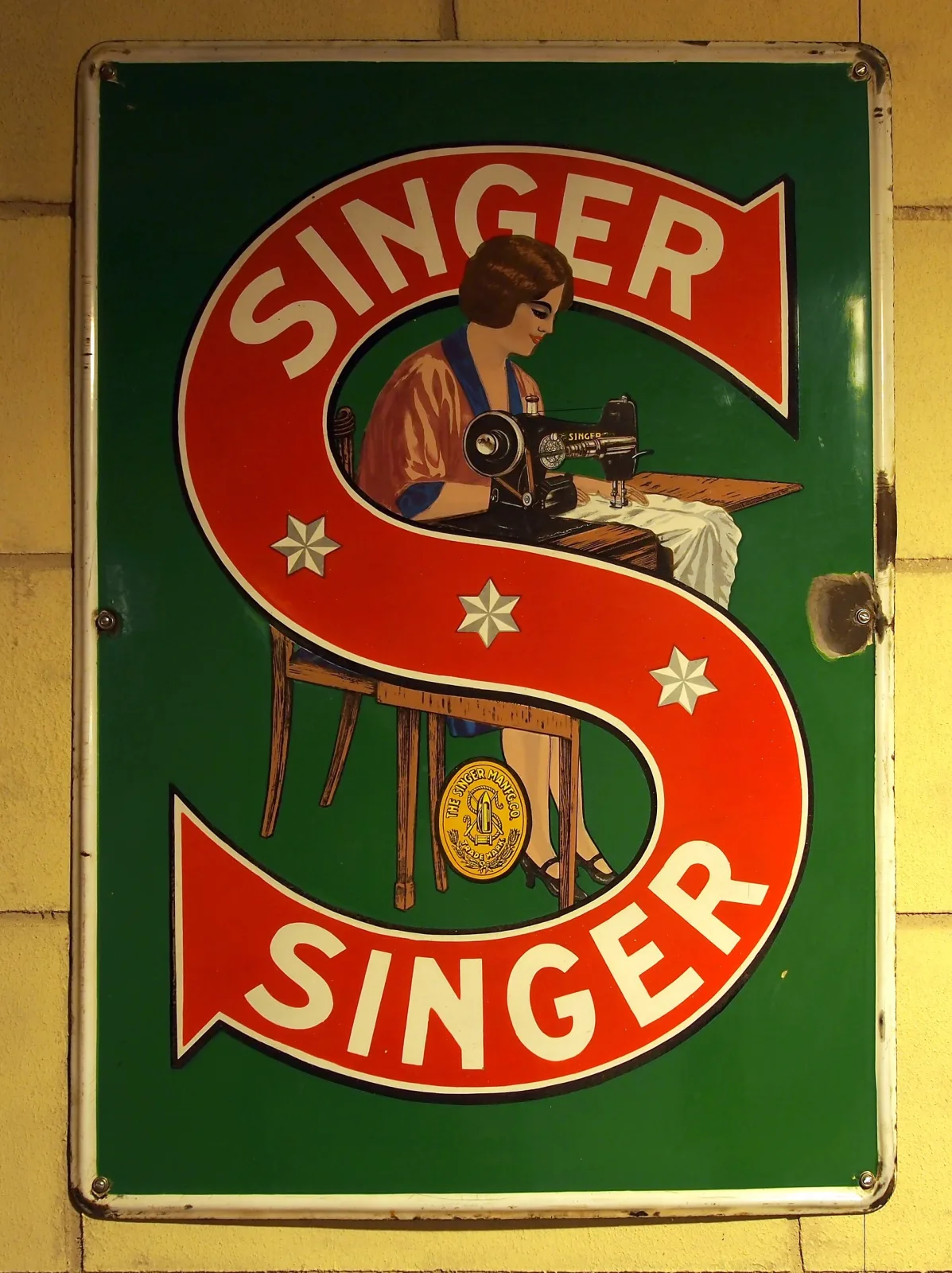
Porcelain enamel advertising signs—fuel brands, farm supply, soda, railroads, and service stations—remain some of the most forged categories in advertising collectibles. Genuine examples reveal a specific marriage of steel plate, ground coat, vitreous enamel layers, stenciled or screened graphics, and correct hardware. This in-depth guide shows how to read backs, edges, grommets, typography, color palettes, maker marks, and usage wear to authenticate, date, and value antique enamel signs confidently. Pair these fundamentals with the Antique Identifier app for instant AI-powered comparisons while keeping restoration and reproduction red flags in mind.
Table of Contents
- Quick Manufacturing Timeline
- Construction: Steel, Enamel Layers, and Backs
- Mounting Holes, Grommets, and Edges
- Typography, Logos, and Graphic Techniques
- Color and Glaze Clues
- Maker Marks, Codes, and Ordering Data
- Common Formats and Their Tells
- Condition Grading, Restoration, and Value Factors
- Reproductions, Fantasy Signs, and Red Flags
- Handling, Preservation, and Storage
- Field Inspection Checklist
Quick Manufacturing Timeline
Dating a porcelain sign begins with its manufacturing era:
- 1890s-1915: Heavy-gauge steel, thick ground coats, hand-cut stencils, bold serif typography, deep cobalt or oxide blues.
- 1915-1935: Growth of screen printing; cleaner registration; more complex color separations; flange and button formats expand.
- 1935-1955: Thinner steel, brighter synthetic pigments, refined screens, more standardized mounting hole placements.
- Post-1955: Shift toward baked metal, aluminum, and plastics; porcelain use declines outside industrial/safety signage.
Construction: Steel, Enamel Layers, and Backs
Authentic signs show layered vitreous enamel fused to steel at high heat:
- Substrate: Mild steel, occasionally cast iron on very early pieces; weight feels substantial.
- Ground coat: Dark brown/black base enamel on back and edges to promote adhesion; usually matte with faint orange peel.
- Front coats: Multiple color firings create slight height differences between colors; ridges can be felt when running a fingernail.
- Backs: Legitimate backs often show kiln furniture marks, hanger shadows, or light speckle from overspray—not perfectly smooth paint.
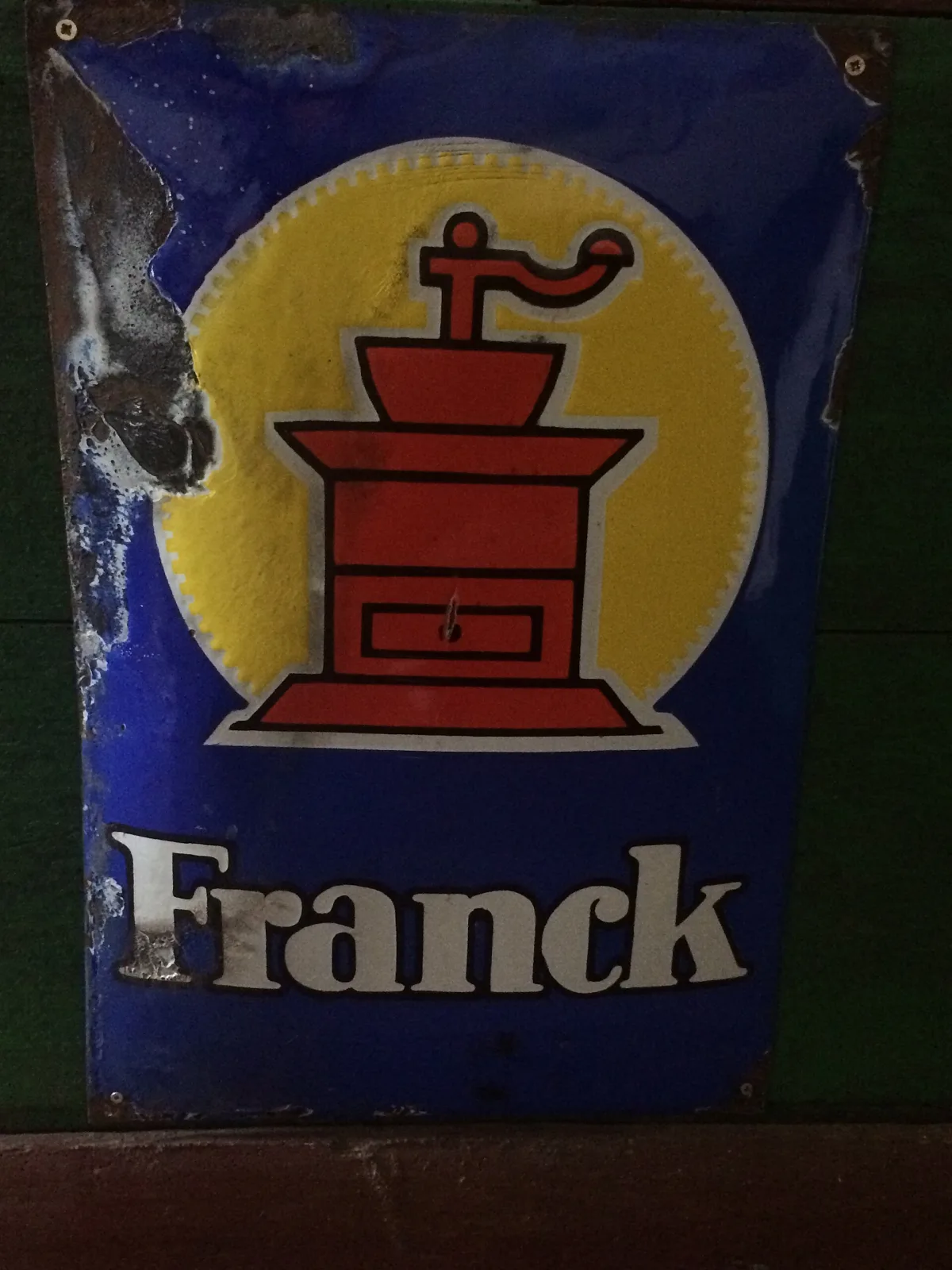
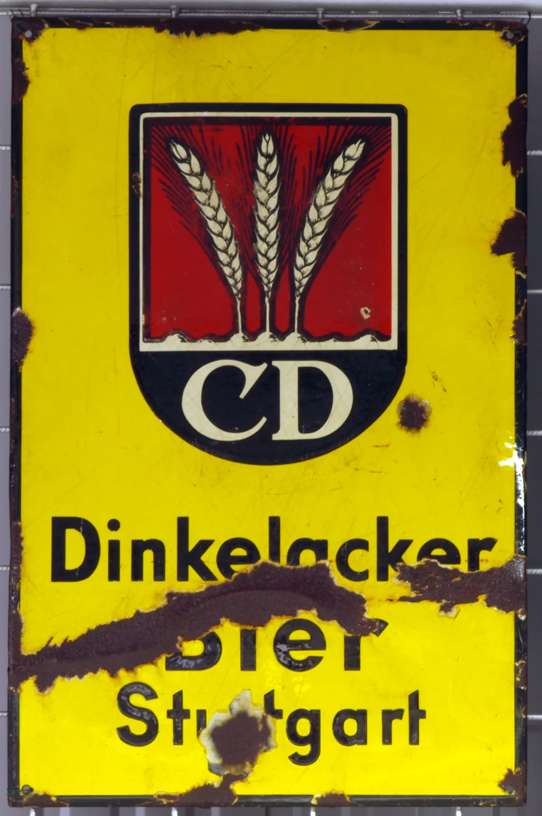
- Crazing and edge chips: Old porcelain chips are glassy with layered depth; modern paint chips expose sharp paint films instead of vitreous glass.
Mounting Holes, Grommets, and Edges
Hole treatments and edge work are major dating clues:
- Hole placement: Early signs may have hand-punched holes with slight irregular spacing; later pieces show more consistent factory spacing.
- Grommets: Brass or steel grommets protect enamel at holes on many pre-1930s signs. Original grommets age evenly; bright new grommets on rusted metal suggest replacement.
- Edge roll and radius: Many pump plates and door pushes have gently rolled edges; flange signs have sharp inside corners and factory bends with enamel cracking at stress points.
- Layer exposure: Chips around holes should reveal dark ground coat then steel; painted reproductions show only primer/paint layers.
Typography, Logos, and Graphic Techniques
Letterforms and registration often separate originals from reissues:
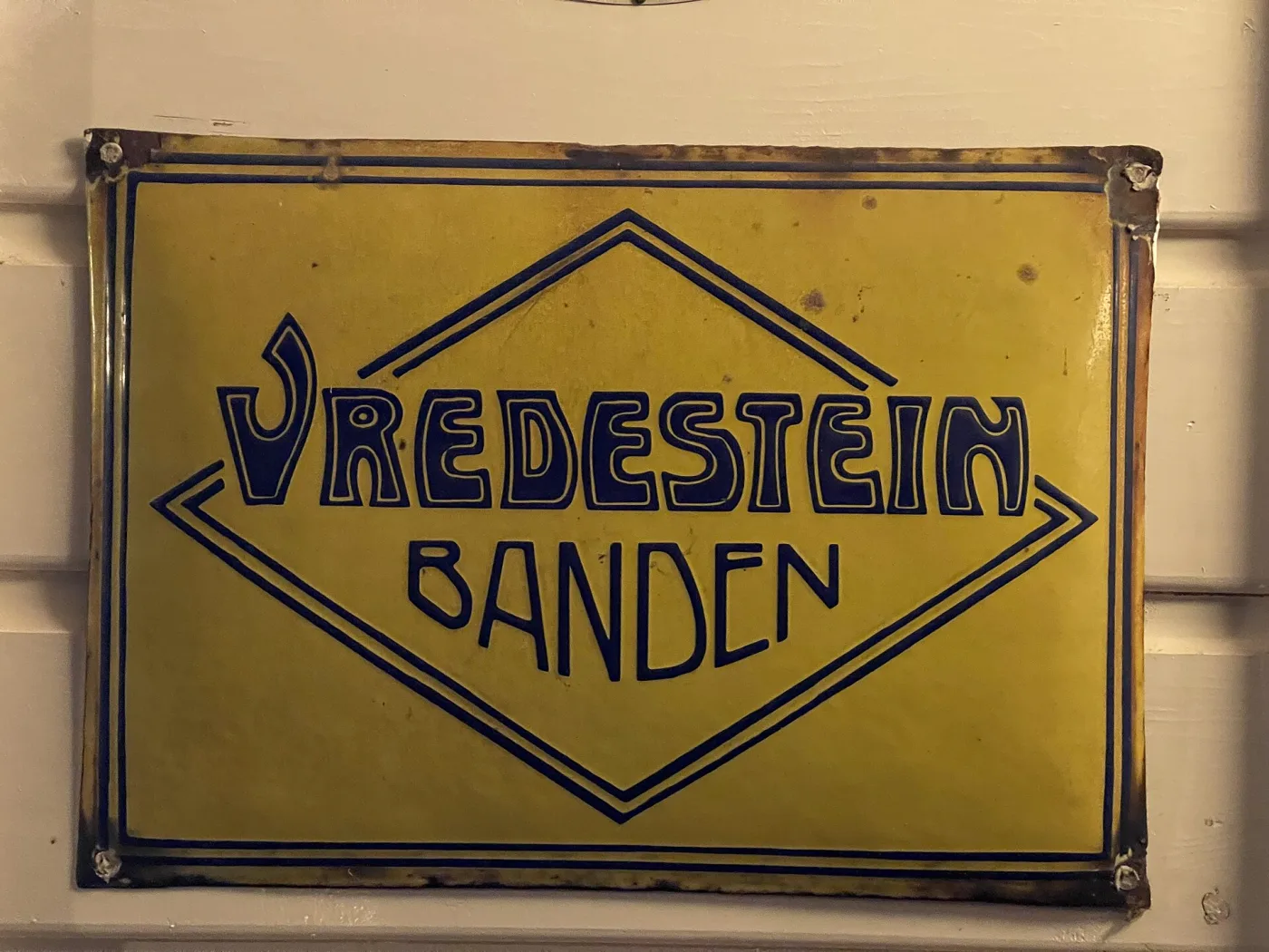
- Period-correct fonts: Late 19th century uses heavy serifs; 1920s-30s adopt streamlined sans serifs and Art Deco geometry; postwar scripts appear in soft drinks and automotive.
- Registration: Early stencil work shows minor underspray or soft edges; screen-printed layers align closely with crisp edges but may leave slight haloes at color junctions.
- Logos and trademarks: Verify historical logo versions and trademark styles for the claimed date range (™ vs ® vs none).
- Line weights: Reproductions often use thicker outlines and simplified art because they are traced from low-resolution sources.

Color and Glaze Clues
Glaze composition and palette help narrow age and authenticity:
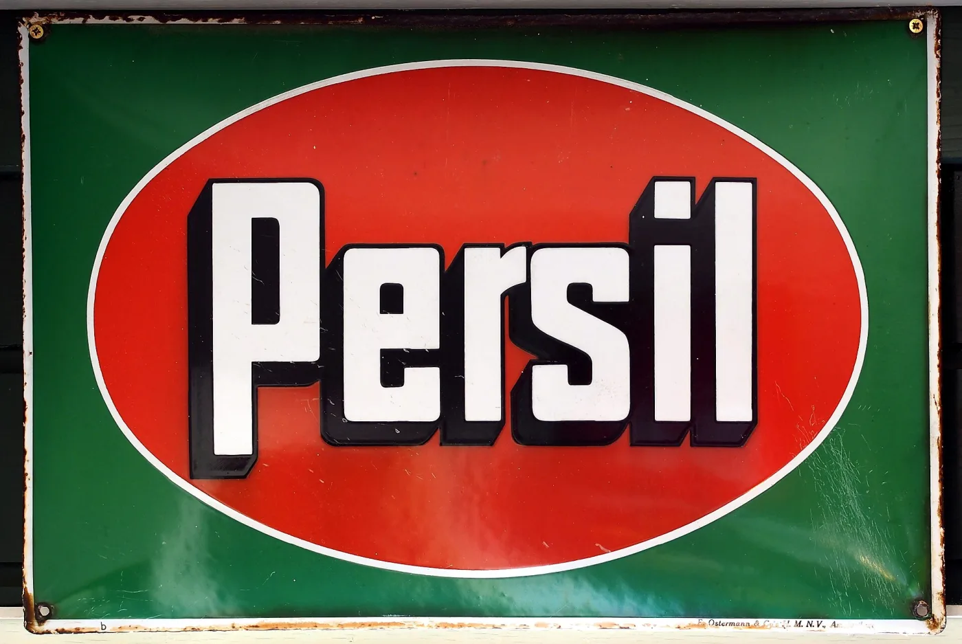
- Depth and glassiness: Old enamel has depth and subtle orange peel; modern paint or powder coat looks flat or plasticky.
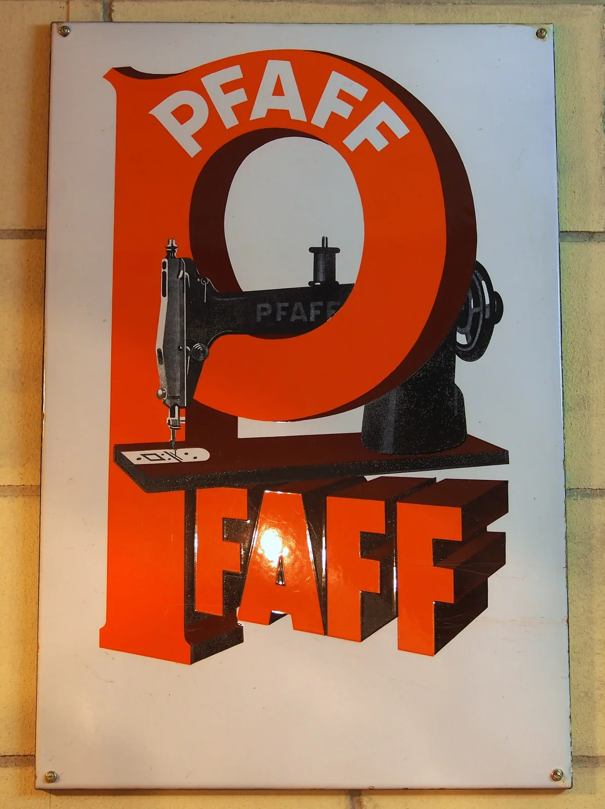
- Historic pigments: Deep cobalt, manganese blacks, chrome greens, and brick reds dominate pre-1930s. Extremely neon or fluorescent tones often indicate modern work.
- UV reaction: Some modern pigments fluoresce differently under UV; use as a supporting clue, not a sole test.
- Color layering: Raised ridges between colors imply multiple firings; perfectly flat transitions suggest printed metal rather than fired porcelain.
Maker Marks, Codes, and Ordering Data
Many authentic signs include manufacturer marks or job codes:
- Factory stamps: Small stenciled or screened text on the face edge or back (e.g., Ingram-Richardson, Beaver Falls; Veribrite; Tennessee Enamel; Walker & Co.).
- Date and job codes: Two- or four-digit year codes, batch numbers, or order numbers near a corner or flange back.
- Railroad and transit plates: Often carry route numbers, division codes, or car assignments stamped into the metal before firing. Porcelain enamel signs are among the most collectible categories of antique railroad memorabilia.
- Absence of marks: Some local or small-order signs lack marks; weigh against other authenticity indicators.
Common Formats and Their Tells
Match form factor to expected construction details:
- Single-sided flat: Wall-mount with grommeted holes; backs show full ground coat.
- Double-sided hangers: Eyelets or bracket holes at top; expect mirrored graphics and balanced weight.
- Flange signs: 90° bend with factory radius; enamel stress lines on the inner bend; mounting holes on flange.
- Buttons/“bullets”: Domed steel with perimeter mounting ring; backs often asphalt- or tar-coated.
- Pump plates: Smaller rectangular plates with rolled edges for gas pumps; often have maker marks on back.
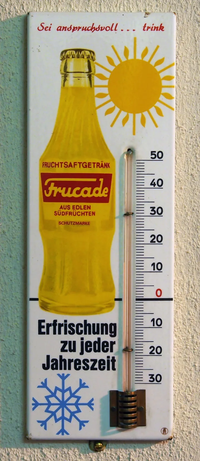
- Thermometers: Tubes held by factory clips; mercury or red alcohol tubes; porcelain cradle shows wear consistent with the tube seat. See the dedicated guide to advertising thermometers for dating and reproduction tells.
Condition Grading, Restoration, and Value Factors
Condition drives price; learn how signs are graded:
- Grade scales: Collectors often use 1-10 or descriptor grades (Fair, Good, VG, Excellent, Mint). Honest edge chips can be acceptable; face damage reduces grade sharply.
- Touch-up detection: Look for glossy acrylic overpaint, mismatched sheen, UV-reactive modern paints, or brush strokes over chips.
- Rust mapping: Original rust follows steel exposure at chips and holes; uniform sprayed “rust” is a reproduction tactic.
- Value drivers: Subject matter (gas/oil, soda, farm), brand popularity, size, graphics strength, rarity, and condition combine to set value.
Reproductions, Fantasy Signs, and Red Flags
Modern fakes are common; use multiple indicators:
- Fantasy subjects: Brands or slogans that never existed, or mashups of unrelated logos.
- Artificial aging: Uniform sandpaper rubs, sprayed rust, or neatly placed chips with no depth.
- Wrong hardware: Bright zinc grommets on supposedly early signs; Phillips screws in display holes for “old” installations.
- Back paint: Gloss paint or powder coat on the back instead of fired ground coat enamel.
- Incorrect fonts and spacing: Modern digital fonts, oversized stroke widths, and vector-perfect edges on “1910” signs.
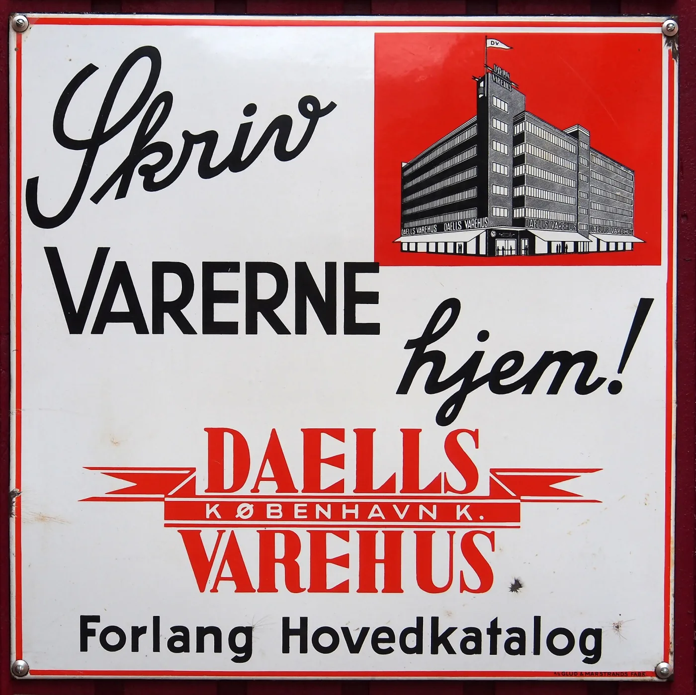
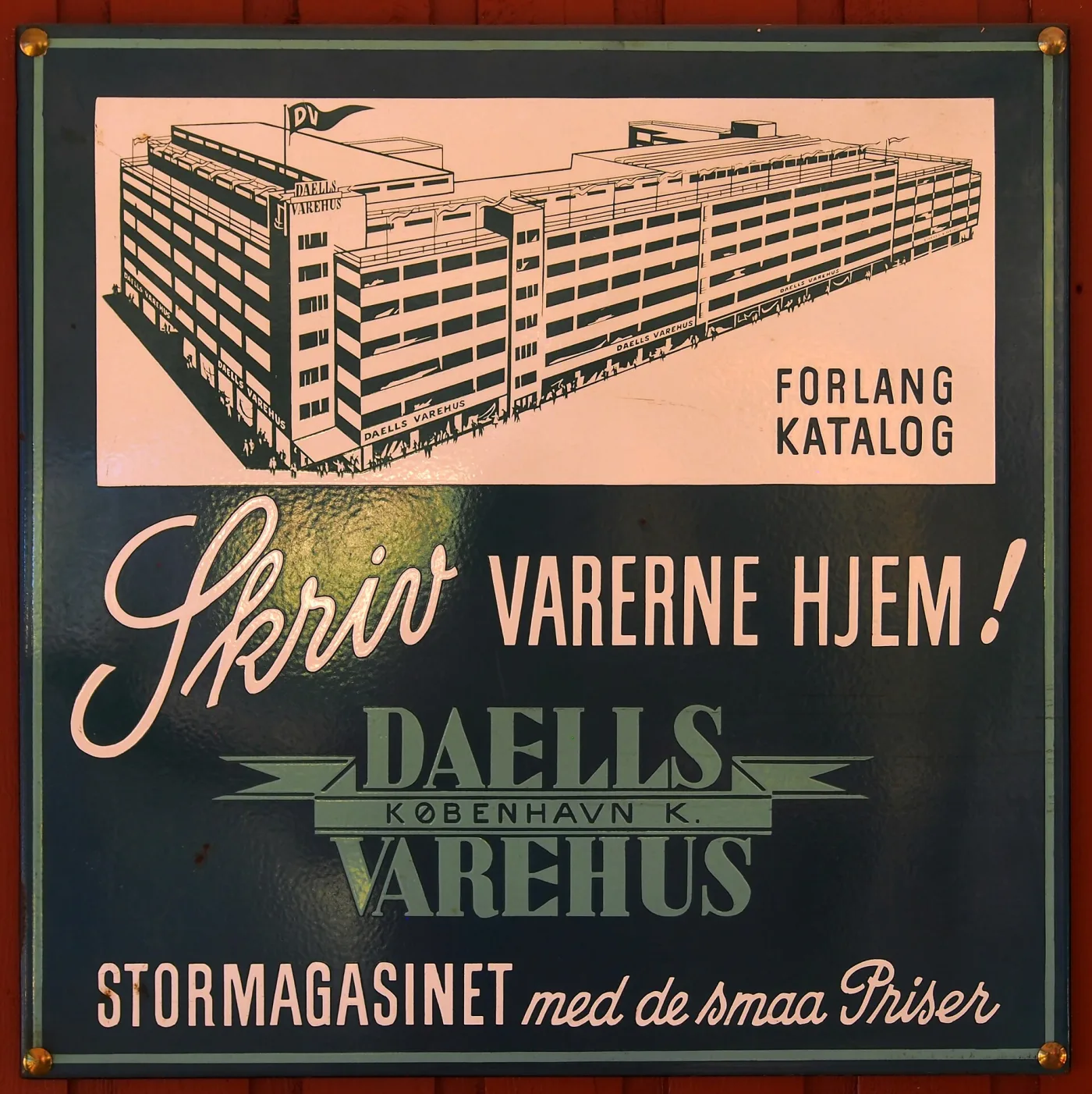
Two signs for one Copenhagen department store, and the pair is worth more than either alone because it shows what variation looks like when it is genuine. The building and the slogan carry over; the ground colour, the palette and the bottom line of text do not. Advertisers reissued signs repeatedly across decades, changing colourways, catalogue wording and sizes, so a design existing in more than one version is normal and is not evidence of a fake. That cuts both ways, and it is the reason the reproduction test has to be physical rather than documentary. You cannot rule a sign out because it does not match the one example you have seen — but equally, a seller cannot rule one in on the same basis. Go back to the enamel: the break edges, the holes, the layer thickness and the weight of the steel decide it, and the artwork never does.
Handling, Preservation, and Storage
Protect enamel surfaces and retain originality:
- Handling: Use padded gloves; avoid contact with chips to prevent flaking.
- Cleaning: Mild soap and water with soft cloth; avoid abrasives and power washers.
- Display: Use rubber washers under screws; avoid over-tightening; keep out of direct, harsh UV if colors are sensitive.
- Storage: Vertical storage with padding between signs; never stack porcelain-to-porcelain.
- Documentation: Photograph backs, edges, and hardware; keep provenance with bill of sale and prior collection notes.
Field Inspection Checklist
Use this rapid workflow when evaluating an enamel sign:
- Back and edges: Fired ground coat? Kiln marks? Rolled or sharp edges consistent with format?
- Holes/grommets: Original grommets with even wear? Layered chips showing glass depth?
- Graphics: Period-correct fonts and logos? Multi-layer ridges between colors?
- Maker data: Factory stamp or code matching era and brand?
- Condition: Honest chips vs overpaint; rust pattern consistent with steel exposure.
- Plausibility: Did this brand make this format in the claimed period? Any fantasy elements?
Conclusion
Authenticating porcelain enamel signs is about layering clues—construction, hardware, typography, pigments, maker marks, and real-world wear patterns. When those signals align with documented brand history, you can buy with confidence and avoid costly reproductions. Keep reference photos, compare to known authentic examples, and leverage expert communities for second opinions.
The Antique Identifier app can accelerate this process with AI-powered visual matching. Combine digital tools with hands-on inspection to protect your collection and make informed acquisitions.