
Antique Biscuit Tins Identification Guide: Makers, Dating & Value
Antique biscuit tins are one of the most approachable collecting categories in decorative advertising and domestic history. They combine graphic design, industrial manufacturing, and social history in a single object. Whether you collect for display, nostalgia, or investment potential, understanding how to read a tin correctly is essential.
This guide explains how to identify authentic period biscuit tins, date them by physical evidence, assess condition consistently, and avoid common reproductions. We focus on practical techniques you can use at markets, antique fairs, and online auctions.
Table of Contents
History of Biscuit Tin Production
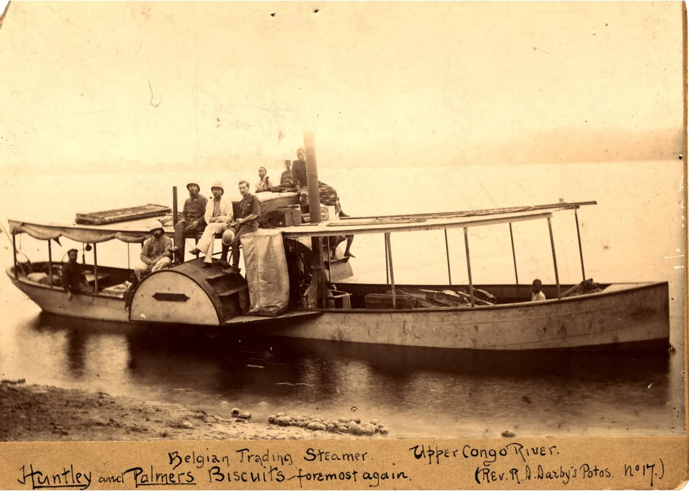
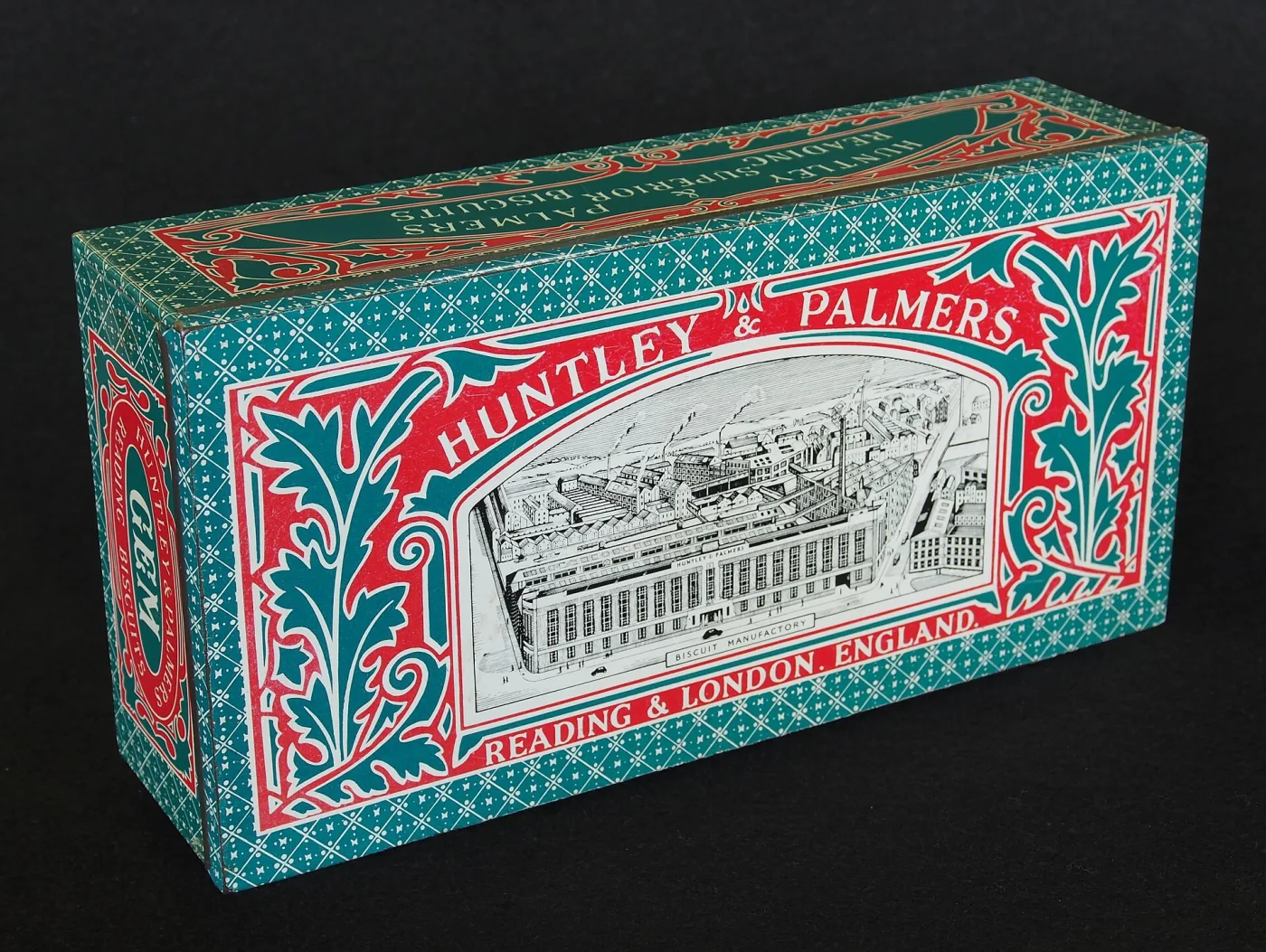
Commercial biscuit tins became widely popular in the late 19th century as food distribution expanded beyond local bakeries. Manufacturers quickly realized that decorated tins were both protective packaging and brand advertising. In Britain, firms such as Huntley & Palmers and Peek Freans commissioned elaborate printed designs intended to be kept and reused in the household.
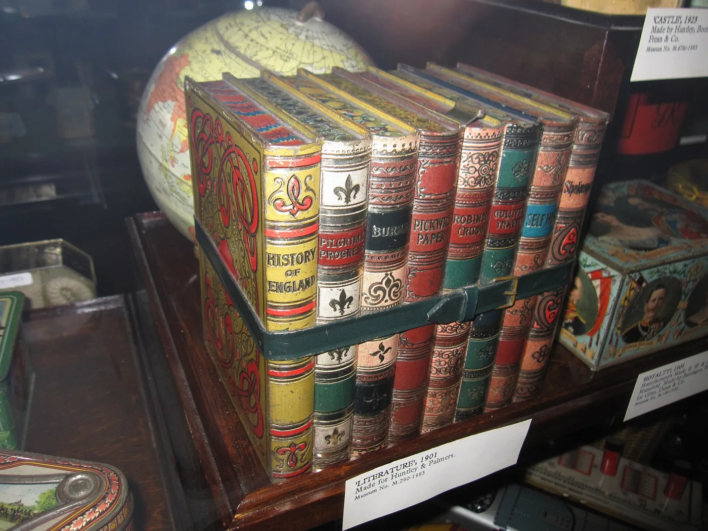
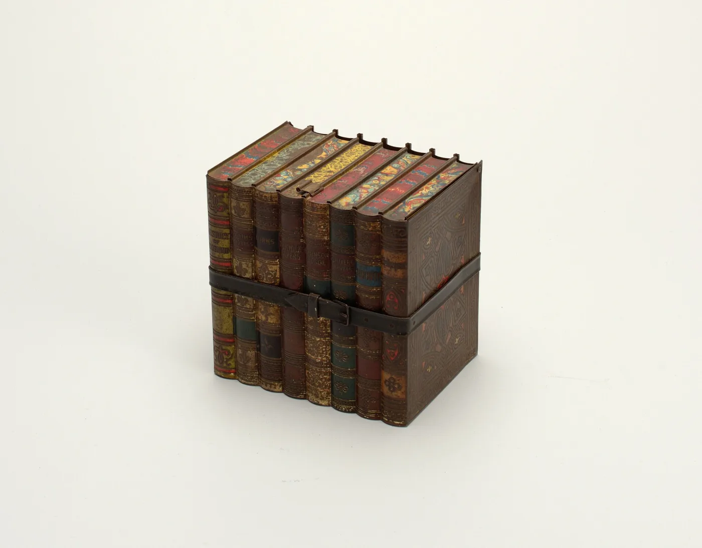
By the Edwardian period, tins appeared in many forms: rectangular family tins, octagonal gift tins, novelty boxes shaped like books or furniture, and commemorative editions tied to royal events. This variety is a major reason collectors remain interested today; each era reflects changing taste, printing technology, and consumer culture.
Construction Clues That Reveal Age
Construction is one of the most dependable dating tools because it is difficult to fake convincingly. Start with seams and joints. Earlier tins often show hand-finished solder lines and slight irregularity at corners. Later mass-produced examples have cleaner machine seams and more uniform rolled edges.
Lid Fit and Hinge Quality
Older lids frequently have subtle play and wear from long use. Hinged lids should feel period-consistent: rivets, pin style, and metal thickness all matter. Modern reproduction hinges tend to feel either too stiff and precise or too thin and lightweight.
Interior Surface and Oxidation
Natural age inside a genuine tin is rarely uniform. You may see dulling, isolated oxidation spots, and darkening around folds where moisture accumulated. Be skeptical of pieces with artificially distressed exteriors but unusually pristine interiors.
Need help identifying a mystery tin?
Use Antique Identifier to compare graphics, materials, and maker clues from a quick photo before you buy.

Key Makers and Brand Signatures
Maker attribution can significantly influence value. Huntley & Palmers, Peek Freans, Carr & Co, and MacFarlane Lang are among the most recognized British names. Continental and American examples also appear, often tied to confectionery companies or department-store private labels.
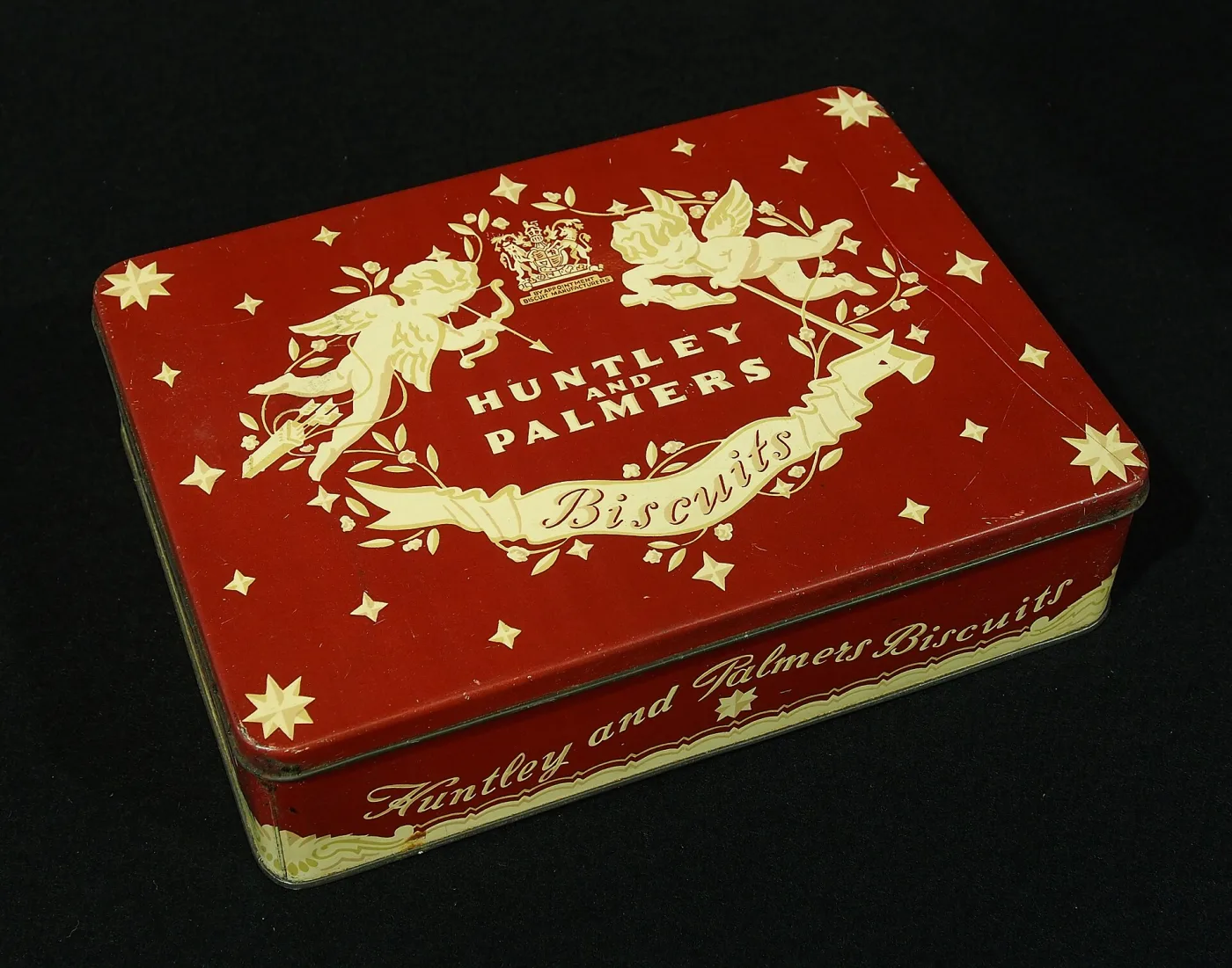
Marks may appear on the base, inner rim, or small printed panels in the design. Some tins include printer credits, patent notes, or registration numbers. When marks are partial, combine typography style, logo form, and shape catalog references to narrow identification.
Dating by Lithography and Graphic Style
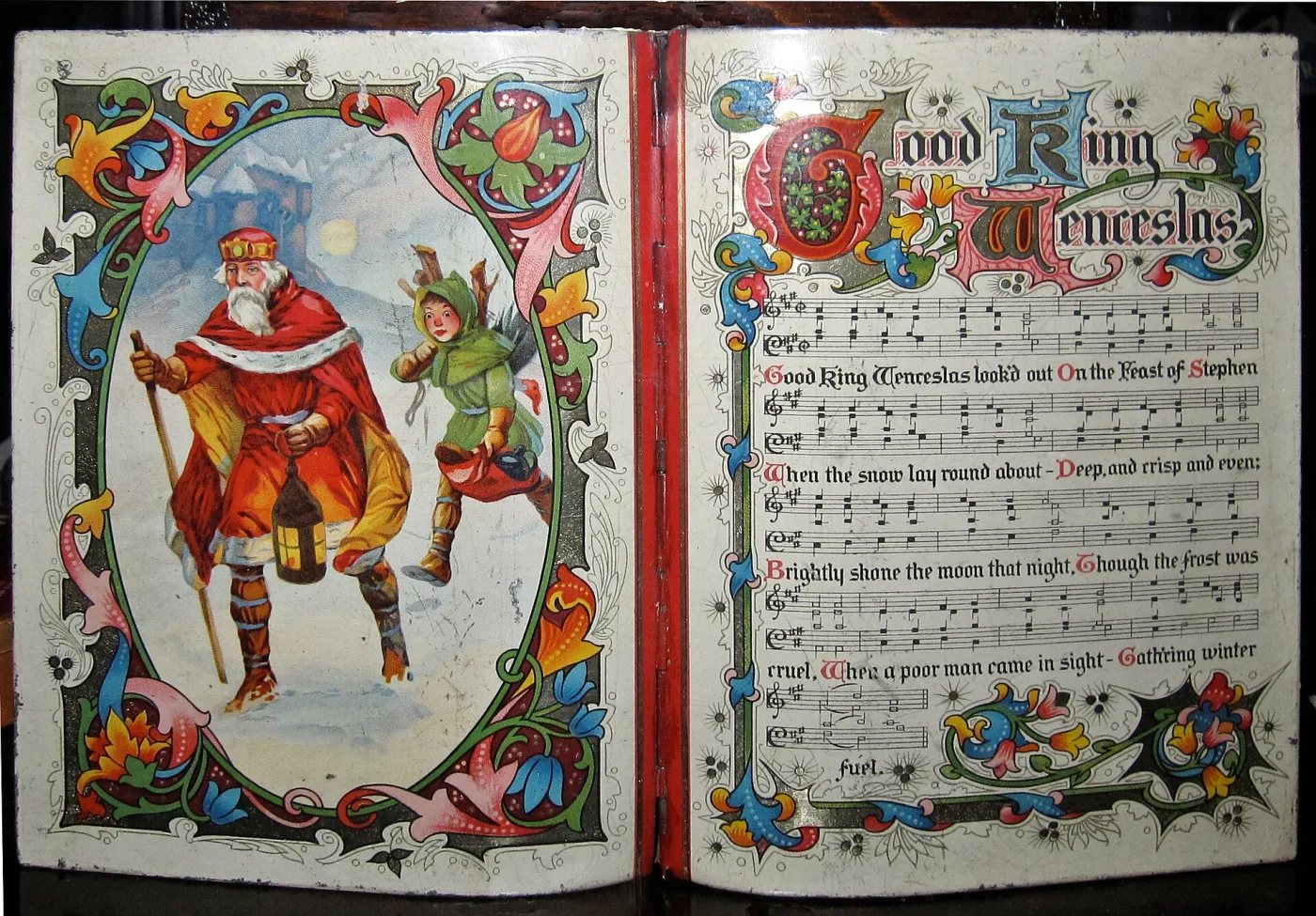
Graphic design evolves quickly, making lithography a powerful dating aid. Late Victorian tins commonly feature ornate floral borders, scripted labels, and rich jewel-like palettes. Edwardian examples often retain decoration but with cleaner spacing and lighter tone. Interwar designs move toward geometric layouts, sans-serif text, and simplified motifs.
Color Behavior Over Time
Authentic lithography usually fades unevenly with handling and sunlight exposure. Edges and raised points lose color first. If wear appears perfectly balanced across all faces, it may be artificial distressing.
Registration and Print Sharpness
Older tins sometimes show minor print misregistration where color layers are fractionally offset. This is normal and can be a positive sign. Completely sterile print alignment on a supposedly 1890s novelty tin should prompt closer scrutiny.
Popular Shapes and Specialty Forms
Standard rectangular tins are the most common entry point for collectors, but specialty forms command premium attention. Book-form tins, chest-form tins, and figural novelty shapes are often more desirable because production numbers were lower and survival rates are reduced.
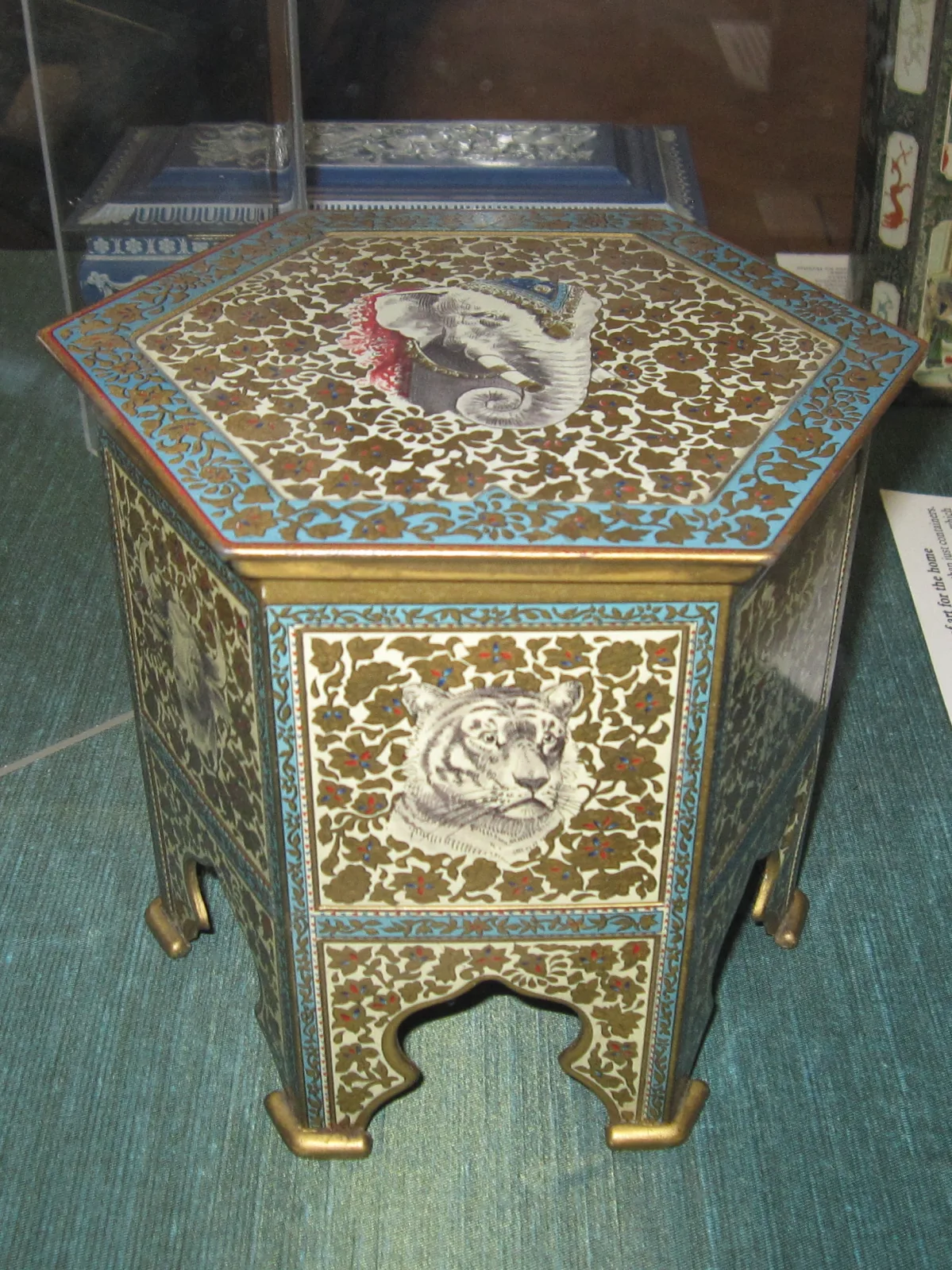
Commemorative tins linked to coronations, exhibitions, or travel destinations also perform well, especially when dated clearly and in strong condition. Regional designs with local landmarks can attract both packaging collectors and local-history buyers.
Condition Grading for Collectors
Condition is the biggest practical value driver for most biscuit tins. Create a repeatable grading method to avoid emotional buying.
Top Grade (Excellent)
Strong original color, minimal corrosion, fully legible graphics, stable seams, and working lid with no major distortion.
Mid Grade (Good)
Moderate paint wear, small rust spots, minor dings, and honest patina. Most collectible market inventory falls in this range.
Lower Grade (Fair/Poor)
Heavy rust, extensive repainting, severe dents, missing lid, or structural weakness. These can still hold decorative or study value but usually trade at large discounts.
How to Spot Reproductions and Decorator Copies
Reproduction biscuit tins are common, especially in highly decorative themes. Some are openly sold as decorative storage, while others are misrepresented as period originals.
- Artificial patina: Uniform brown wash, repeated scratch patterns, or paint rubbed only at obvious corners.
- Modern steel feel: Lighter gauge metal and sharper machine bends than expected for period production.
- Incorrect typography: Font styles that do not match the claimed era.
- Fantasy maker statements: Fake factory marks or dates added to boost credibility.
When in doubt, compare with documented auction archives and museum examples rather than relying on a single seller description.
Value Ranges and Market Trends
Values vary by maker, rarity, condition, and decorative impact. Common rectangular tins in good condition often trade in affordable ranges, while rare novelty forms or exceptional lithography can command strong premiums.
- Common early 20th-century tins: typically entry-level collector pricing.
- Named maker tins with quality graphics: moderate to strong collector demand.
- Rare novelty or commemorative forms: premium segment with competitive bidding.
- Provenance-backed examples: additional buyer confidence and often better liquidity.
Market momentum currently favors clean graphics, unusual forms, and honest untouched surfaces. Over-restored tins usually underperform compared with well-preserved originals showing natural wear.
Quick Buying Checklist
Before purchasing, run a short checklist: verify maker clues, inspect seams and lid fit, check for repainting, grade condition objectively, and compare asking price with recent sold examples. Taking photos of all sides and interior details helps with post-visit verification and negotiation.
If you build this routine into every purchase decision, you will make fewer expensive mistakes and develop a stronger, better-curated collection over time.